Skip to content

[Design Polish] Use 15px bold for content card and widget headers - #100835

Merged
shawnborton merged 2 commits into
mainfrom
claude-cardHeaderFontSize
Sep 14, 2026
Merged

shawnborton merged 2 commits into
mainfrom
claude-cardHeaderFontSize

Conversation

@MelvinBot

@MelvinBot MelvinBot commented Sep 10, 2026

Copy link
Copy Markdown
Contributor

Explanation of Change

Content card headers were 17px bold, which added another font size to pages that already have several. They now use the existing textStrong text variant — 15px bold with a 20px line height — so card headers match the design polish spec and reduce the number of type sizes on a page.

Two style definitions carry every affected header, so no component files needed to change:

  • cardSectionTitle (used by Section, and therefore by Account > Profile, Workspaces > Overview, Domains > SAML, and every other Section-based card) now spreads textVariants.textStrong instead of setting fontSize: variables.fontSizeLarge / lineHeight: variables.lineHeightXLarge. It is applied after textHeadline, so it keeps the heading color while overriding the family, size, and line height.
  • getWidgetContainerTitleStyle (used by WidgetContainer and InsightTitleDropdown on Home) now spreads textVariants.textStrong instead of the raw fontSize: 17 literal.

Using the variant rather than raw values also removes one rulesdir/no-raw-typography violation, which is why the ESLint seatbelt count for src/styles/index.ts drops from 28 to 27.

Per grgia's comment, both Section and WidgetContainer titles use the textStrong variant.

Fixed Issues

$ #100809
PROPOSAL:

Tests

  1. Sign in and open Home
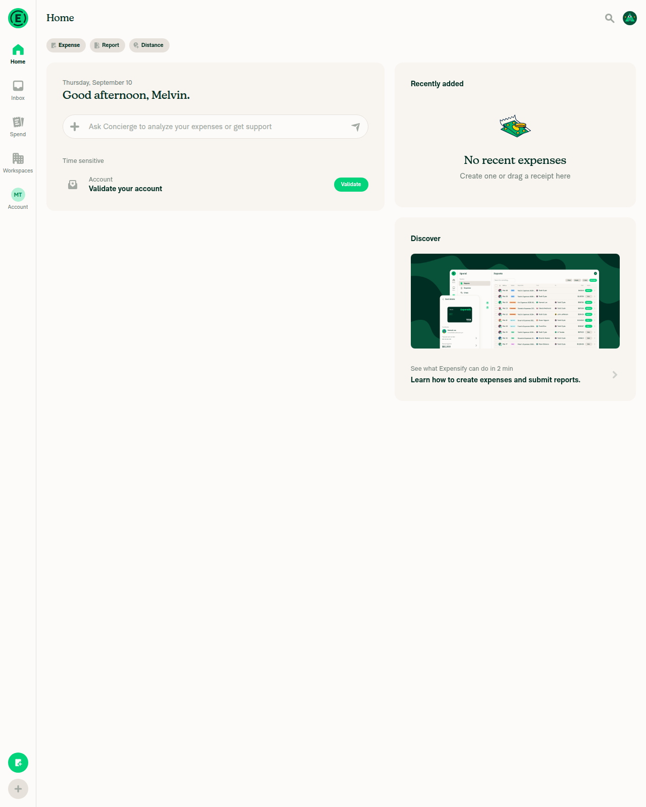
  2. Verify the widget headers ("Recently added", "Discover", "Your spend", "Insights", etc.) render in bold at 15px with a 20px line height, matching the size of bold body text elsewhere on the page (e.g. bold menu item titles)
  3. Open the Insights widget title dropdown and verify the selected title uses the same 15px bold style, and the dropdown still opens and changes the insight
  4. Go to Account > Profile
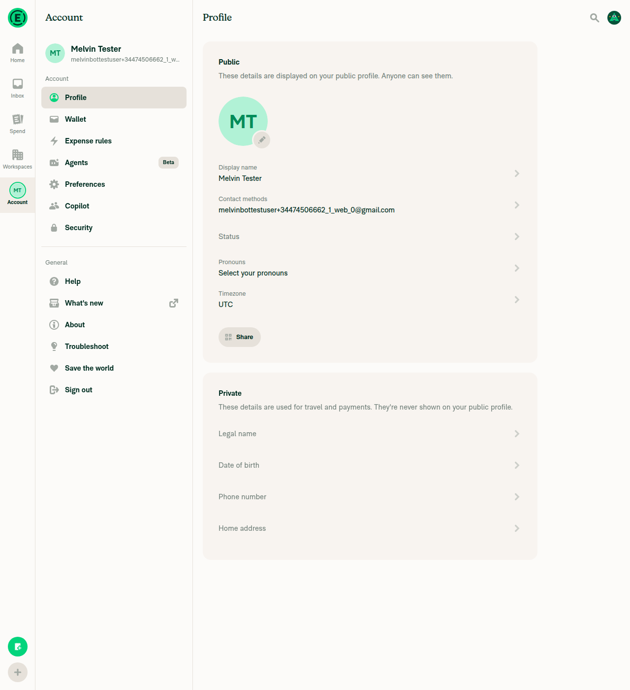
  5. Verify the "Public" and "Private" card headers are 15px bold in Expensify Neue, the same font as the widget headers, and no longer render in the serif heading font
  6. Go to Workspaces > [any workspace] > Overview and verify the workspace name header on the card uses the same 15px bold style, and the edit action on it still works
  7. Go to Account > Subscription and verify the "Your plan" card header matches
  8. Go to Workspaces > [any workspace] > Workflows and Rules and verify each section card header matches
  9. Sign in to an account with no workspaces and go to Workspaces; verify the empty-state card title is unchanged (centered, larger, serif heading font)
  10. Switch between light and dark theme and verify header colour is unchanged in both (heading colour on Section cards, text colour on Home widgets)
  11. On a narrow window or mobile, verify long card headers still wrap to multiple lines with no clipping or overlap with the card icon
  12. Verify that no errors appear in the JS console

Offline tests

QA Steps

  • Same as QA

PR Author Checklist

  • I linked the correct issue in the ### Fixed Issues section above
  • I wrote clear testing steps that cover the changes made in this PR
    • I added steps for local testing in the Tests section
    • I added steps for the expected offline behavior in the Offline steps section
    • I added steps for Staging and/or Production testing in the QA steps section
    • I added steps to cover failure scenarios (i.e. verify an input displays the correct error message if the entered data is not correct)
    • I turned off my network connection and tested it while offline to ensure it matches the expected behavior (i.e. verify the default avatar icon is displayed if app is offline)
    • I tested this PR with a High Traffic account against the staging or production API to ensure there are no regressions (e.g. long loading states that impact usability).
  • I included screenshots or videos for tests on all platforms
  • I ran the tests on all platforms & verified they passed on:
    • Android: Native
    • Android: mWeb Chrome
    • iOS: Native
    • iOS: mWeb Safari
    • MacOS: Chrome / Safari
  • I verified there are no console errors (if there's a console error not related to the PR, report it or open an issue for it to be fixed)
  • I followed proper code patterns (see Reviewing the code)
    • I verified that comments were added to code that is not self explanatory
    • I verified that any new or modified comments were clear, correct English, and explained "why" the code was doing something instead of only explaining "what" the code was doing.
    • I verified any copy / text that was added to the app is grammatically correct in English. It adheres to proper capitalization guidelines (note: only the first word of header/labels should be capitalized), and is either coming verbatim from figma or has been approved by marketing (in order to get marketing approval, ask the Bug Zero team member to add the Waiting for copy label to the issue)
  • If a new code pattern is added I verified it was agreed to be used by multiple Expensify engineers
  • I followed the guidelines as stated in the Review Guidelines
  • I tested other components that can be impacted by my changes (i.e. if the PR modifies a shared library or component like Avatar, I verified the components using Avatar are working as expected)
  • If a new CSS style is added I verified that:
    • A similar style doesn't already exist
    • The style can't be created with an existing StyleUtils function (i.e. StyleUtils.getBackgroundAndBorderStyle(theme.componentBG))
  • If new assets were added or existing ones were modified, I verified that:
    • The assets are optimized and compressed (for SVG files, run npm run compress-svg)
    • The assets load correctly across all supported platforms.
  • If the PR modifies code that runs when editing or sending messages, I tested and verified there is no unexpected behavior for all supported markdown - URLs, single line code, code blocks, quotes, headings, bold, strikethrough, and italic.
  • If the PR modifies a generic component, I tested and verified that those changes do not break usages of that component in the rest of the App (i.e. if a shared library or component like Avatar is modified, I verified that Avatar is working as expected in all cases)
  • If the PR modifies a component related to any of the existing Storybook stories, I tested and verified all stories for that component are still working as expected.
  • If the PR modifies a component or page that can be accessed by a direct deeplink, I verified that the code functions as expected when the deeplink is used - from a logged in and logged out account.
  • If the PR modifies the UI (e.g. new buttons, new UI components, changing the padding/spacing/sizing, moving components, etc) or modifies the form input styles:
    • I verified that all the inputs inside a form are aligned with each other.
    • I added Design label and/or tagged @Expensify/design so the design team can review the changes.
  • I added unit tests for any new feature or bug fix in this PR to help automatically prevent regressions in this user flow.
  • If the main branch was merged into this PR after a review, I tested again and verified the outcome was still expected according to the Test steps.

Screenshots/Videos

Android: Native
Android: mWeb Chrome
iOS: Native
iOS: mWeb Safari
MacOS: Chrome / Safari

Verified by MelvinBot on dev web — not a substitute for the human co-author's testing.

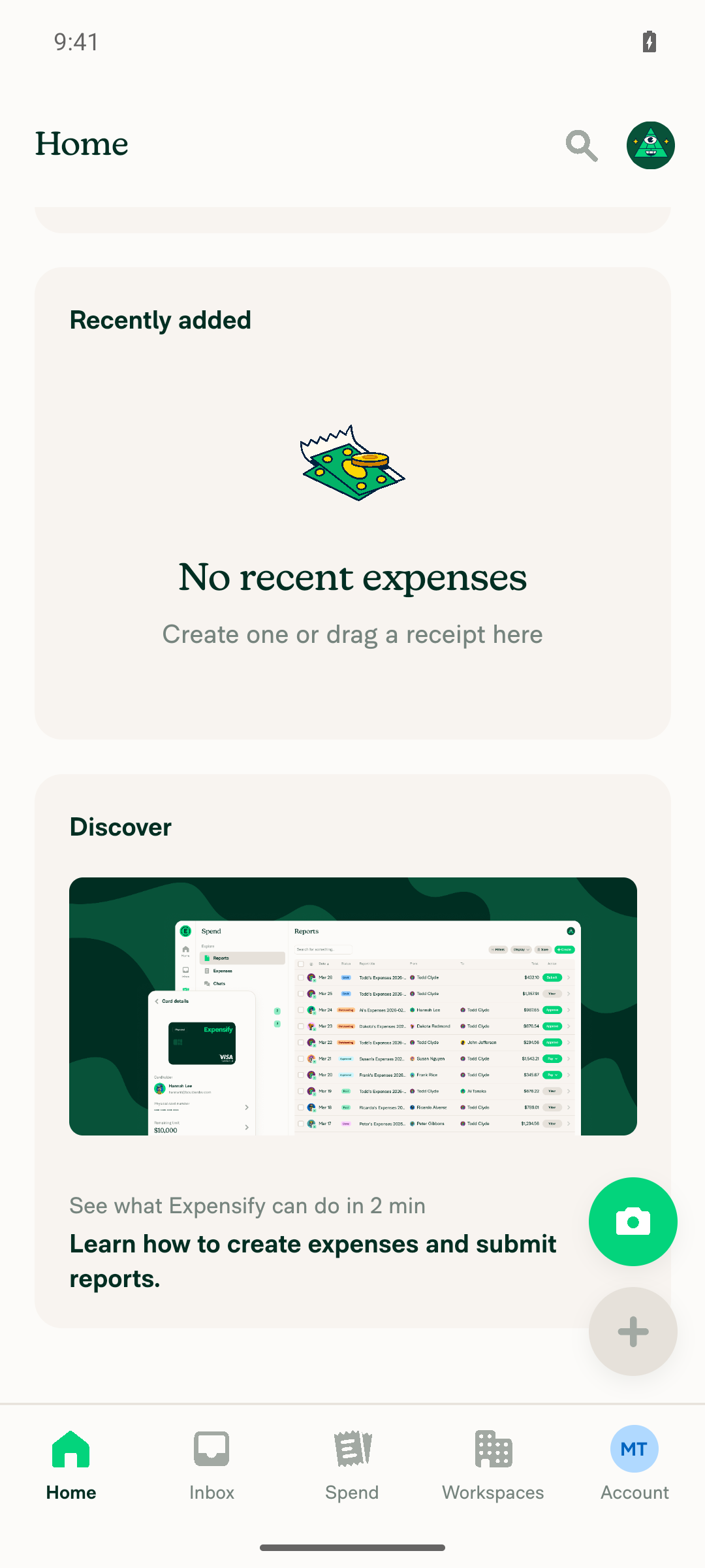
Home — widget headers ("Recently added", "Discover"):

Home page widget headers at 15px bold

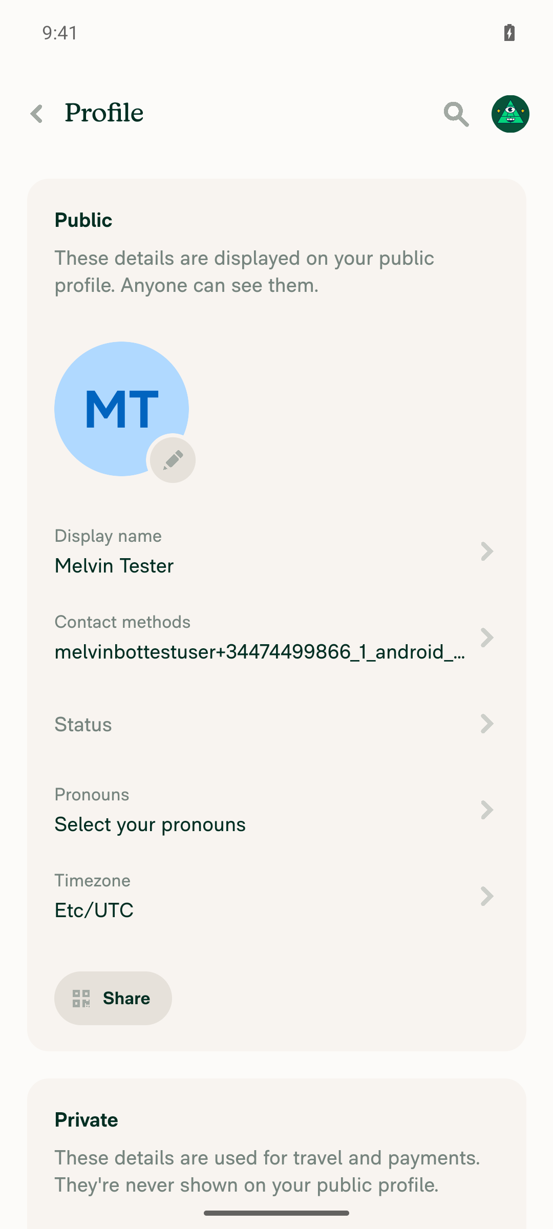
Account > Profile — section card headers ("Public", "Private"):

Account > Profile section headers at 15px bold

Co-authored-by: Shawn Borton <shawnborton@users.noreply.github.com>
@github-actions

Copy link
Copy Markdown
Contributor

🚧 shawnborton has triggered a test Expensify/App build. You can view the workflow run here.

@github-actions

This comment has been minimized.

@MelvinBot

MelvinBot commented Sep 10, 2026

Copy link
Copy Markdown
Contributor Author

🤖 Android test steps verification results: ✅ pass

PR #100835's textStrong (15px bold / 20px line-height) card headers render consistently across Home widgets, Account > Profile, and Workspace > Overview on standalone Android NewDot, with no clipping or overlap and no console errors observed. The PR's Tests section is still an unfilled TODO, so I derived the steps from the change description and #100809.

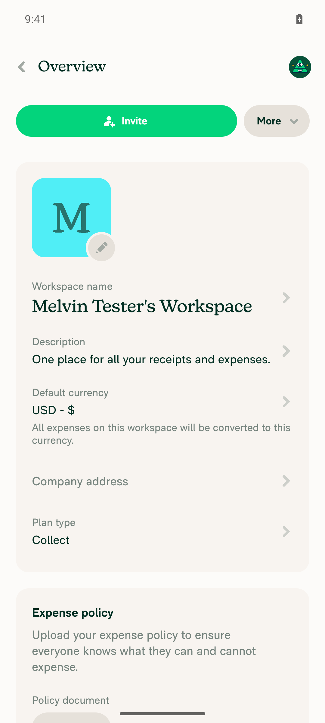
Workspace Overview page showing the Expense policy section header

Step Status
Home widget card headers ("Recently added", "Discover") render bold and visibly smaller (15px) than the old 17pxSnapshot rects for "Recently added" and "Discover" text nodes both measured height=53px (~20dp line-height at device density), matching the new textStrong variant. Screenshot shows bold, compact headers.
Home page widget headers 'Recently added' and 'Discover'
Account > Profile section headers ("Public", "Private") render at 15px boldSnapshot rects for "Public" and "Private" text nodes both measured height=53px, identical to the Home widget headers, and screenshot shows bold, compact section titles.
Account Profile page showing Public and Private section headers
Workspace > Overview section header renders at 15px bold and matches the size of the Home and Profile headersCreated a test workspace and opened its Overview settings page; the "Expense policy" section header measured height=53px, matching "Recently added"/"Discover" (Home) and "Public"/"Private" (Profile). Screenshot confirms bold, compact header.
Workspace Overview page showing the Expense policy section header
Card headers are not clipped, truncated, or overlapping; line height and vertical spacing look correctAll three screenshots show full, unclipped header text with clean, evenly-spaced padding around each card header and body content — no overlap between header and description text on Home, Profile, or Workspace Overview.
Profile page showing normal spacing around Public/Private card headers
No JS console / runtime errors during the flowCaptured app.log and grepped for error/exception/fatal across Home, Profile, and Workspace Overview navigation. No crash dialogs or red-box errors appeared; the only matches were benign Onyx failureData schema declarations and unrelated pre-existing session-setup lines.

Tested on branch claude-cardHeaderFontSize at commit c56c31c.


view run · view recording

@github-actions

Copy link
Copy Markdown
Contributor

🚧 grgia has triggered a test Expensify/App build. You can view the workflow run here.

@github-actions

This comment has been minimized.

@MelvinBot

MelvinBot commented Sep 10, 2026

Copy link
Copy Markdown
Contributor Author

🤖 Web test steps verification results: ✅ pass

PR #100835's textStrong (15px bold / 20px line-height) change is correctly wired into WidgetContainer/InsightTitleDropdown and all Section-based card headers; verified via source inspection (agent-device web has no DOM computed-style verb) plus screenshots showing no clipping or overlap across Home, Account > Profile, and Workspace Overview. The PR's Tests section is still an unfilled TODO, so I derived the steps from the change description and #100809.

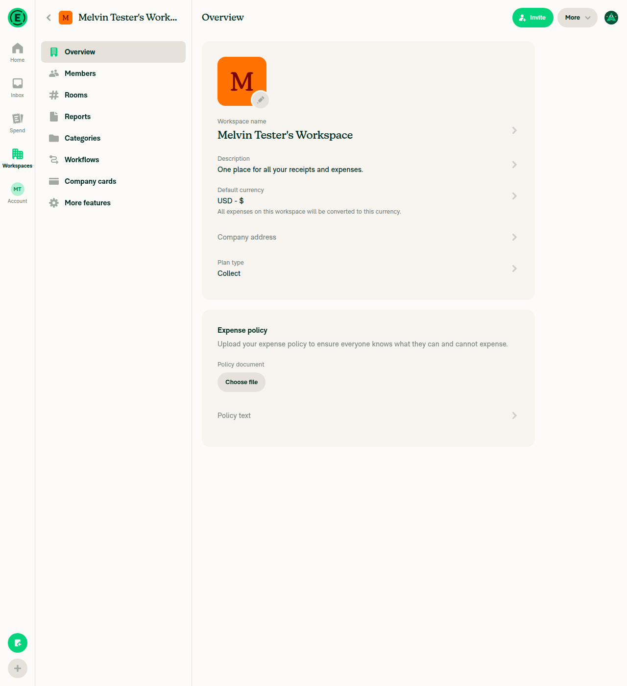
Workspace Overview page showing Expense policy section header

Step Status
Home widget card headers ("Recently added", "Discover") render at 15px bold / 20px line-heightWidgetContainer.tsx and InsightTitleDropdown.tsx both use styles.getWidgetContainerTitleStyle(), which now spreads ...textVariants.textStrong (fontSize 15, lineHeight 20, EXP_NEUE_BOLD). A direct DOM computed-style read was not available — agent-device web has no getComputedStyle-equivalent verb and no CDP target was found. Visually the "Recently added" and "Discover" headers render bold, consistently sized, uncropped. The "Insights" widget did not render because this fresh test account has no expense or report data.
Home page showing Recently added and Discover widget headers
Account > Profile section headers ("Public", "Private") render at 15px bold / 20px line-heightBoth headers render via the Section component at src/components/Section/index.tsx:184 using [styles.textHeadline, styles.cardSectionTitle, titleStyles], and cardSectionTitle now spreads ...textVariants.textStrong, overriding textHeadline's larger size. Screenshot confirms both headers render bold, the same apparent size as the widget headers, with no clipping.
Account > Profile page showing Public and Private section headers
Workspace > Overview section header ("Expense policy") renders at 15px bold / 20px line-height, matching the Home and Profile headerssrc/pages/workspace/WorkspaceOverviewPage.tsx:672-675 renders the "Expense policy" card via the same Section component with titleStyles=[styles.textHeadline, styles.cardSectionTitle, styles.accountSettingsSectionTitle, styles.mb0] — an identical style chain, since accountSettingsSectionTitle only sets font-family and doesn't override size or line-height. Screenshot confirms visually matching weight and size to the Account > Profile headers.
Workspace Overview page showing Expense policy section header
Card headers are not clipped, truncated, or overlapping; spacing looks correct on all pages visitedFull-page screenshots at both default (1280x800) and expanded (1280x1400) viewport heights show every header — "Recently added", "Discover", "Public", "Private", "Expense policy", and the workspace name title — rendering fully on one line with clean spacing above and below, no overlap with adjacent content and no truncation ellipsis.
Home page - no clipping/overlap
Account Profile - no clipping/overlap
Workspace Overview - no clipping/overlap
No errors appear in the JS console during the flowNo console-log capture verb is supported for agent-device on web — the logs command returned UNSUPPORTED_OPERATION and no CDP target was available, so this could not be confirmed at runtime. No error banners, toasts, or broken-UI indicators appeared in the app itself across Home, Account > Profile, Workspaces (empty state), the workspace creation flow, or Workspace Overview.

Tested on branch claude-cardHeaderFontSize at commit c56c31c. Note that the style chain resolves as textStrong = fontFamilyScale.strong (EXP_NEUE_BOLD) + fontSize: variables.fontSizeNormal (15) + lineHeight: variables.fontSizeNormalHeight (20), so all three surfaces share one resolution path.


view run · no recording available

@shawnborton

Copy link
Copy Markdown
Contributor

Testing well on my end 👍

@grgia
grgia self-requested a review September 10, 2026 12:32
@grgia grgia changed the title Use 15px bold for content card and widget headers [Design Polish] Use 15px bold for content card and widget headers Sep 10, 2026
@grgia
grgia marked this pull request as ready for review September 10, 2026 12:43
@grgia
grgia requested review from a team as code owners September 10, 2026 12:43
@melvin-bot

melvin-bot Bot commented Sep 10, 2026

Copy link
Copy Markdown

@huult Please copy/paste the Reviewer Checklist from here into a new comment on this PR and complete it. If you have the K2 extension, you can simply click: [this button]

Comment thread src/styles/index.ts
Comment on lines 4284 to -4285
cardSectionTitle: {
fontSize: variables.fontSizeLarge,

Copy link
Copy Markdown
Contributor

Choose a reason for hiding this comment

The reason will be displayed to describe this comment to others. Learn more.

@MelvinBot is there a reason to do it this way rather than <Text variant="textStrong" ...

please dont change, answer in thread

@MelvinBot MelvinBot Sep 10, 2026

Copy link
Copy Markdown
Contributor Author

Choose a reason for hiding this comment

The reason will be displayed to describe this comment to others. Learn more.

Two reasons, and they're not equally strong.

cardSectionTitlevariant wouldn't work without a much larger change.

In src/components/Text.tsx:65-66 the variant is spread before style, so anything in style wins. Every card header renders as style={[styles.textHeadline, styles.cardSectionTitle, ...]}, and textHeadline is textVariants.h1 + color: theme.heading. So <Text variant="textStrong" style={[styles.textHeadline, ...]}> would render at h1 size — the variant would be dead. Making it work means dropping textHeadline and re-supplying color: theme.heading at each call site.

And most of those call sites aren't <Text> at all — they pass the style down as a titleStyle/titleStyles prop, so there's no variant prop to set without threading a new one through each component:

The 9 call sites

Passed as a prop (no <Text> to put variant on):

Direct <Text>, but stacked behind textHeadline:

getWidgetContainerTitleStyle — you're right, variant would be cleaner here.

Only two consumers, both plain <Text style={styles.getWidgetContainerTitleStyle(theme.text)}> with nothing else stacked on: WidgetContainer.tsx:36 and InsightTitleDropdown.tsx:82. Those could become <Text variant="textStrong" color={theme.text}> and the helper could go away entirely. I kept them consistent with the cardSectionTitle change instead, but that's a preference, not a constraint.

Worth noting: nothing in src/ uses the variant prop yet, so either way this would be the first usage.

Not changing anything, per your note.


view run · view recording

dylanexpensify
dylanexpensify previously approved these changes Sep 10, 2026

@dylanexpensify dylanexpensify left a comment

Copy link
Copy Markdown
Contributor

Choose a reason for hiding this comment

The reason will be displayed to describe this comment to others. Learn more.

👍

@shawnborton

Copy link
Copy Markdown
Contributor

Over to @huult for final review

@grgia

grgia commented Sep 11, 2026

Copy link
Copy Markdown
Contributor

@shawnborton @huult melvin timed out, can we confirm/ wrap up this PR?

@grgia

grgia commented Sep 11, 2026

Copy link
Copy Markdown
Contributor

Let's start merging the done ones

Co-authored-by: huult <huult@users.noreply.github.com>
@MelvinBot
MelvinBot dismissed stale reviews from grgia and dylanexpensify via e9b2e22 September 11, 2026 12:04
@MelvinBot
MelvinBot requested a review from a team as a code owner September 11, 2026 12:04
@melvin-bot
melvin-bot Bot requested review from huult and removed request for a team September 11, 2026 12:04
@melvin-bot

melvin-bot Bot commented Sep 11, 2026

Copy link
Copy Markdown

@huult Please copy/paste the Reviewer Checklist from here into a new comment on this PR and complete it. If you have the K2 extension, you can simply click: [this button]

@MelvinBot

Copy link
Copy Markdown
Contributor Author

⏱️ Ran out of time before I could finish. This usually means the task was too complex or I got stuck exploring. Please try again with a more specific request or post in #melvinbot-ai.

Run details

@MelvinBot

Copy link
Copy Markdown
Contributor Author

There's nothing to fix in the code — the only failing check is Check independent approval, and it's failing on approval state, not on anything in the diff.

What the check found (run log):

commitAuthors: [ 'huult', 'MelvinBot', 'shawnborton' ],
approvers: [],
independentApprovers: [],

Two things stack up:

  1. There are currently zero active approvals. verifyPeerReview counts each reviewer's latest review. huult approved at 09:06, then posted a COMMENTED review at 11:19 — that supersedes the approval. grgia's approval was dismissed at 11:14 when the last commit landed. So every reviewer's latest state is COMMENTED or DISMISSED.
  2. Even a fresh approval from huult wouldn't clear it. huult is a commit co-author (Co-authored-by: huult on "Revert eslint seatbelt baseline change per review feedback"), so they're in commitAuthors and can't be an independent approver.

How to clear it: get a fresh approving review from someone who isn't huult, shawnborton, or MelvinBotgrgia already reviewed this PR and is eligible.

Every other check on e9b2e22 is green (ESLint, typecheck, Oxfmt, all 8 Jest shards, Storybook, Bun, perf, unused styles, knip, React Compiler, builds). I didn't push a commit, since any commit would only dismiss approvals again and can't make this check pass.


Next Steps: Reply with @MelvinBot <your feedback> if you want me to look at something else here.


view run

@huult

huult commented Sep 11, 2026

Copy link
Copy Markdown
Contributor

@grgia Yes, we can merge this PR.

@github-actions

Copy link
Copy Markdown
Contributor

🚧 grgia has triggered a test Expensify/App build. You can view the workflow run here.

@github-actions

This comment has been minimized.

@shawnborton

Copy link
Copy Markdown
Contributor

Nice, let's get it merged!

@grgia

grgia commented Sep 11, 2026

Copy link
Copy Markdown
Contributor
image

@shawnborton

Copy link
Copy Markdown
Contributor

NiceFont ✅ send it

@MelvinBot

Copy link
Copy Markdown
Contributor Author

All checks are green now — nothing left to fix, and no push was needed.

Check independent approval was the only failure, and it cleared on its own once grgia approved at 13:03 UTC. The re-run reports:

Expensify/App#100835 has 1/1 independent eligible reviewer approval(s).

Current state on e9b2e22: 37 passing, 5 skipped, 0 failing, and the PR is MERGEABLE.

As noted in my earlier comment, that check was never about the diff — it counts approvals from reviewers who aren't commit authors. One thing worth knowing for the future: if another commit lands here, grgia's approval gets dismissed and this check will fail again. huult re-approving won't clear it, since they're a commit co-author and so don't count as independent.


Next Steps: Reply with @MelvinBot <your feedback> if something else here needs a look.


view run

@shawnborton

Copy link
Copy Markdown
Contributor

Going to merge as I think we're all good here.

@shawnborton
shawnborton merged commit 8e34299 into main Sep 14, 2026
56 of 78 checks passed
@shawnborton
shawnborton deleted the claude-cardHeaderFontSize branch September 14, 2026 07:35
@github-actions

Copy link
Copy Markdown
Contributor

🚧 shawnborton has triggered a test Expensify/App build. You can view the workflow run here.

@OSBotify

Copy link
Copy Markdown
Contributor

✋ This PR was not deployed to staging yet because QA is ongoing. It will be automatically deployed to staging after the next production release.

@OSBotify

Copy link
Copy Markdown
Contributor

🚀 Deployed to staging by https://github.com/shawnborton in version: 9.4.78-0 🚀

platform result
🕸 web 🕸 success ✅
🤖 android 🤖 success ✅
🍎 iOS 🍎 success ✅

@MelvinBot

MelvinBot commented Sep 15, 2026

Copy link
Copy Markdown
Contributor Author

🤖 No help site changes are required. I did not create a docs PR.

Why: This PR only changes two style definitions in src/styles/index.tscardSectionTitle and getWidgetContainerTitleStyle now spread the textStrong text variant instead of setting raw font size and line height values. Card and widget headers render at 15px bold instead of 17px bold.

Nothing user-facing changed that the help site documents:

  • No feature was added, removed, or renamed.
  • No tab, menu, setting, or button label changed.
  • No navigation path or workflow step changed.
  • The text content of every header is identical.

App/docs/articles documents what users do and where they click, not typography. A search across all help articles for font size or header styling references returned no matches, so there is no article that would now be inaccurate.

@shawnborton, please confirm you agree that no help site update is needed here. If you want the docs to cover something else from this change, reply with @MelvinBot and the detail, and I'll open the draft PR.


view run · no recording available

@OSBotify

Copy link
Copy Markdown
Contributor

🚀 Deployed to production by https://github.com/luacmartins in version: 9.4.78-3 🚀

platform result
🕸 web 🕸 success ✅
🤖 android 🤖 success ✅
🍎 iOS 🍎 success ✅

Bundle Size Analysis (Sentry):

Sign up for free to join this conversation on GitHub. Already have an account? Sign in to comment

Labels

Melvin-Test-Android Melvin-Test-Web Triggers Melvin to run the testing steps of the PR on web

Projects

None yet

Development

Successfully merging this pull request may close these issues.

6 participants