Skip to content

fix(web): banner button hover follows the banner's rounded corners - #29018

Open
Byntham wants to merge 1 commit into
pingdotgg:mainfrom
Byntham:t3/fix-notification-button-hover
Open

Byntham wants to merge 1 commit into
pingdotgg:mainfrom
Byntham:t3/fix-notification-button-hover

Conversation

@Byntham

@Byntham Byntham commented Nov 2, 2026

Copy link
Copy Markdown
Contributor

Problem

The hover highlight on banner buttons like "Disconnect server" was lopsided. Its top-end corner curved to match the banner, but its bottom-end corner stayed small. It looked worst in the reconnecting notice under the new-thread composer.

Reported: the Disconnect server hover has a round top corner and a tight bottom corner

Change

The last button in a banner's first row gets a larger corner radius so its hover nests inside the banner's rounded corner. That rule assumed every banner has a rounded top and a hidden bottom, which is only true for the first banner attached to the composer. Now the button's corners follow the card's real corners:

  • Detached banners (new-thread view) are round on all four corners, so the button rounds its bottom-end too. A banner with a body below its first row (Usage limits) keeps a normal bottom corner.
  • Attached banners stacked below another banner have a square top, so their button keeps its normal radius. They used the same lopsided shape before.

The change is in ComposerBanner.tsx. The top corner reads a CSS variable that the existing "joined card" selectors reset.

Scope and approval

This is a small visual fix to an existing component. It adds no behavior and touches one file. It extends the concentric-corner rule from #17695 to the detached banners added in #26958.

Verification

Captures use the real ComposerBannerStack in the web dev client, dark theme, with every button forced into its hover state.

Before After
Before: corner buttons round only their top-end, including on square-topped stacked cards After: corner buttons follow each card's real corners

Computed border-radius of each corner button after the fix:

Banner Before After
Detached, one row 8 12 8 8 8 12 12 8
Detached, with body 8 12 8 8 8 12 8 8
Attached, first 8 12 8 8 8 12 8 8
Attached, stacked below another 8 12 8 8 8 8 8 8
  • vp run check:changed passed.
  • Not covered: on narrow widths the actions can wrap to a second row. CSS cannot detect that wrap, so the corner rule still assumes one row there.

Reviewed with sol-loop: 1 round with gpt-6.1-sol. Sol verdict: approved

Created with Claude Opus 5.5 in Claude Code (T3 Code).

🤖 Generated with Claude Code

Co-Authored-By: Claude Opus 5.5 <noreply@anthropic.com>
@github-actions github-actions Bot added vouch:unvouched PR author is not yet trusted in the VOUCHED list. size:S 10-29 changed lines (additions + deletions). labels Nov 2, 2026
@macroscopeapp

macroscopeapp Bot commented Nov 2, 2026

Copy link
Copy Markdown
Contributor

Approvability

Verdict: Approved at 61ba1c6

Macroscope's review found this PR approvable — Composer-banner action buttons now follow the rounded corners of attached and detached banners. The change is limited to visual styling and leaves button behavior and product defaults unchanged.

You can add or adjust custom eligibility rules. Learn more.

@coderabbitai

coderabbitai Bot commented Nov 2, 2026

Copy link
Copy Markdown
Contributor

Review in Change Stack →

No actionable comments were generated in the recent review.

Recent review info
Run configuration
Commits

Reviewing files that changed from the base of the PR and between dd6c05e and 61ba1c6.

Files selected for processing: 1
  • apps/web/src/components/chat/ComposerBanner.tsx

Included review availability: This review used your included allowance. Your plan provides up to 10 included reviews per hour; 9 remain after this review.

Walkthrough

ComposerBanner updates corner-radius styling for attached and detached surfaces. Attachment selectors set a shared top-corner radius. Root uses that radius for tight-density action buttons and adds bottom rounding for the final action button in a detached single-row surface.

Changes: Composer banner styling

Layer / File(s) Summary
Attached and detached corner styles
apps/web/src/components/chat/ComposerBanner.tsx
Attachment selectors set the shared top-corner radius. Root uses it for tight-density action buttons and rounds the final action button’s bottom corners when the surface is detached and has a single row.

Estimated code review effort: 2 (Simple) | ~7 minutes

Change: Bug fix

Suggested reviewers: t3dotgg, juliusmarminge

Merge Risk: Minimal · up to 61ba1

The banner corner styling change has no established merge-blocking risk.

Pre-merge checks: Passed 4
Check name Status Explanation
Title check Passed The title clearly and concisely describes the main change: matching banner button hover corners to the banner's rounded corners. It uses a valid conventional commit format.
Description check Passed The description includes all required sections. It explains the problem, the implementation, scope, approval rationale, verification results, visual evidence, and known narrow-width limitations.
Linked Issues check Passed Check skipped because no linked issues were found for this pull request.
Out of Scope Changes check Passed Check skipped because no linked issues were found for this pull request.
Finishing Touches
Generate unit tests (beta)
  • Create a new PR
  • Autofix · Keep fixing CodeRabbit findings and required CI, and resolving merge conflicts

@maria-rcks

maria-rcks commented Nov 2, 2026 •

Copy link
Copy Markdown
Collaborator

Note

Written by gpt-6.1-sol on behalf of Maria

Verified in a real dev environment

verified exact head 61ba1c679e280d3cb9ef87c589d03699138df514 with repository Playwright and /usr/bin/google-chrome on Linux. main and the pr each ran a real background dev server, one at a time, with isolated state. no mocks, fixtures, or demo data.

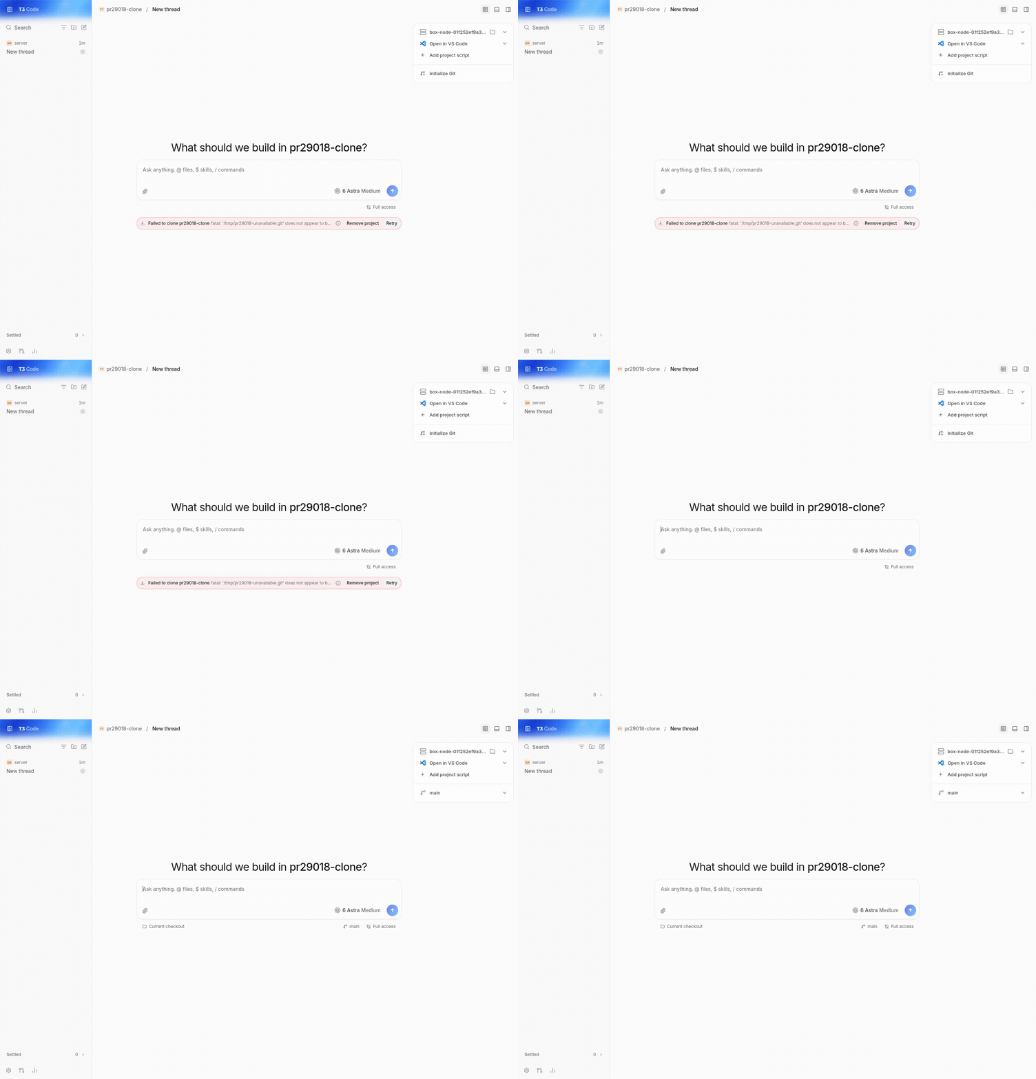
  • reproduced on github/main (cc59f99e73): add project -> Git URL -> a genuinely unavailable local repository -> failed-clone banner -> hover retry. its clockwise corner radii were 8 12 8 8 px.
  • repeated the same flow on the pr: 8 12 12 8 px, matching the detached card. the captures below use the same repository path and viewport.
  • made the source git repository available and clicked retry. the real clone completed, the failure banner cleared, and the checkout became usable.
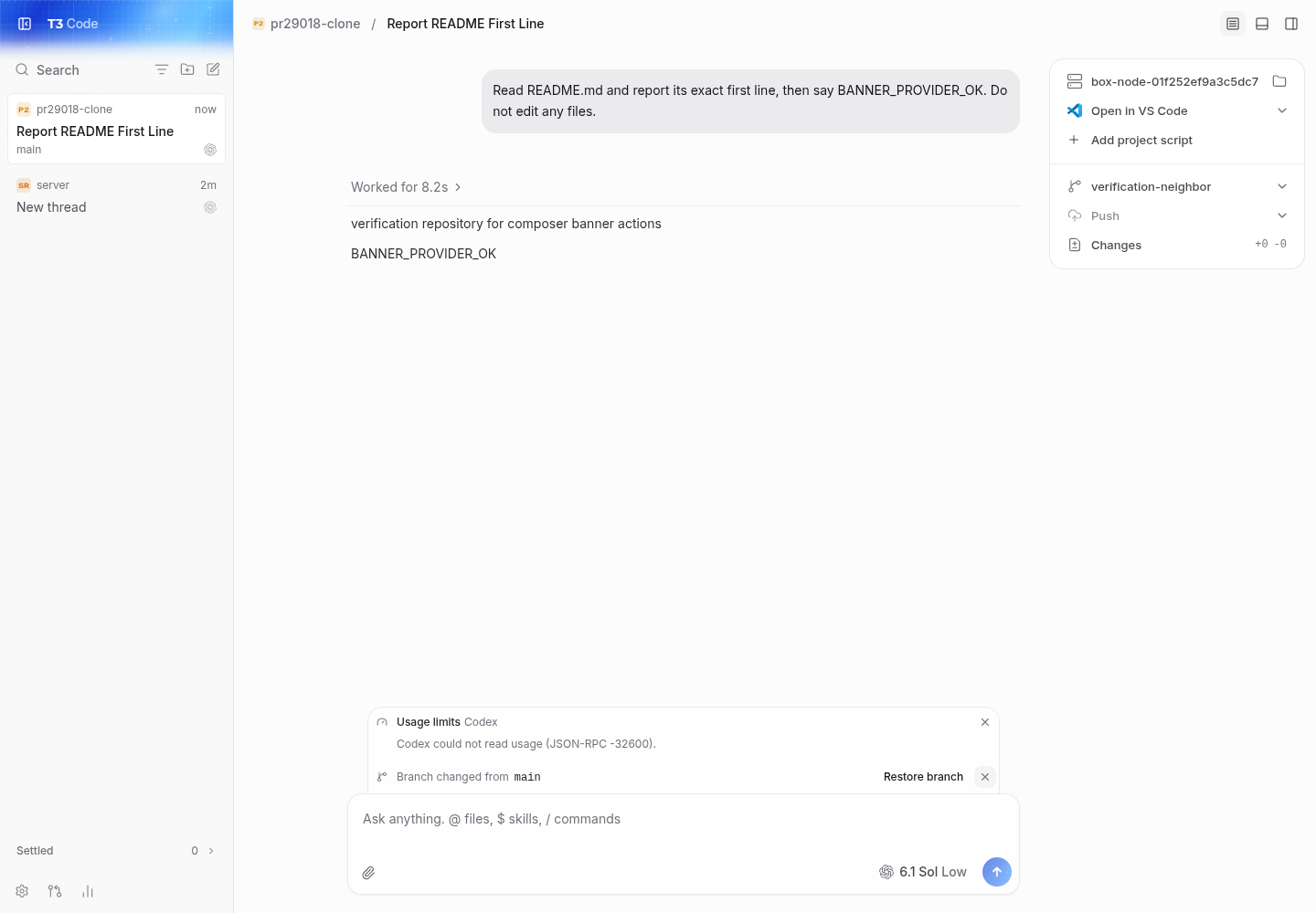
  • selected Codex gpt-6.1-sol and sent a real turn through the web composer. it read README.md and returned its actual first line plus BANNER_PROVIDER_OK.
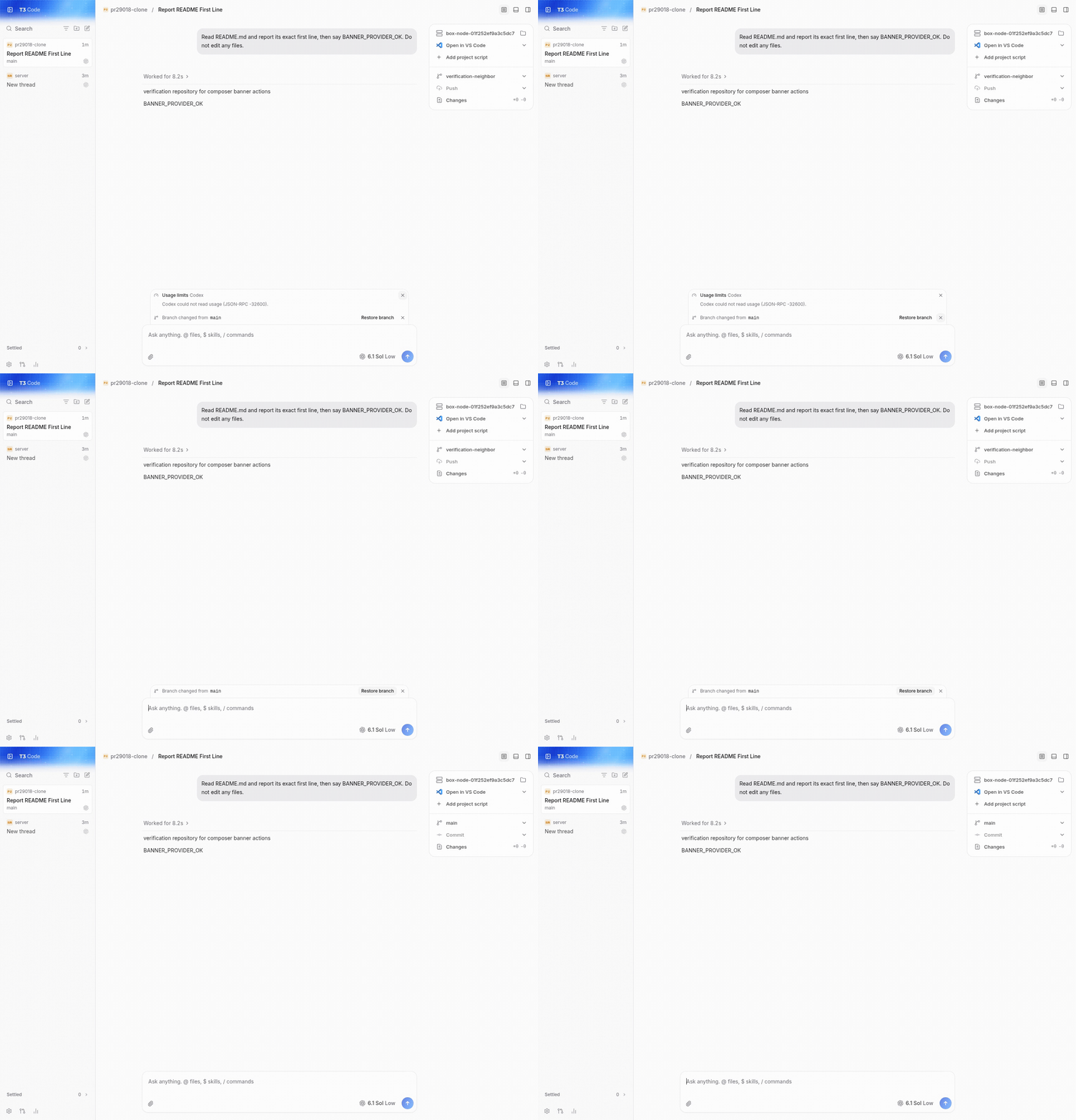
  • switched that checkout's branch, opened /usage-limits, and exercised the real stacked banners. the first card's dismiss button retained 8 12 8 8 px because it has a body; the lower card's dismiss button used 8 8 8 8 px. dismissing usage, restoring the original branch, and independently dismissing the branch notice all worked.
  • vp run check:changed dd6c05ec313c6c870c7a7688e87143da5084031d passed through blacksmith-check: format, lint, both knip checks, affected typechecks, and React Compiler coverage. GitHub checks are green. no code changes were needed.

before on main: retry hover has an 8px bottom-right corner

after on the pr: retry hover has matching 12px right corners

real codex response and stacked usage and branch-change banners

retry completes the real git clone and clears the banner

dismiss usage and restore the real checkout branch

Not verified

  • native Electron, iOS, Android, macOS, and Windows clients; this run used the Linux web client at 1440x1000.
  • the secondary-server reconnect notice's specific disconnect action. the shared banner styling was exercised through real clone and branch-change actions instead.
  • actual quota values: the local Codex proxy returns JSON-RPC -32600 for usage. its real unavailable-usage body and dismiss action were exercised.
  • narrow-width action wrapping and dark-theme banner appearance.

captured images were inspected; both uploaded recordings were played fully and seeking was verified.

This branch has not been deployed

No deployments
Sign up for free to join this conversation on GitHub. Already have an account? Sign in to comment

Labels

size:S 10-29 changed lines (additions + deletions). vouch:unvouched PR author is not yet trusted in the VOUCHED list.

Projects

None yet

Development

Successfully merging this pull request may close these issues.

2 participants