[No QA] MenuItem decomposition - usages with avatars - #98862
roryabraham merged 44 commits into
Conversation


# Conflicts:
#	src/pages/workspace/companyCards/assignCard/ConfirmationStep.tsx

Codecov Report✅ Changes either increased or maintained existing code coverage, great job!
|

|
@codex review |
|
@MelvinBot review |

|
Codex Review: Didn't find any major issues. You're on a roll. Reviewed commit: ℹ️ About Codex in GitHubCodex has been enabled to automatically review pull requests in this repo. Reviews are triggered when you
If Codex has suggestions, it will comment; otherwise it will react with 👍. When you sign up for Codex through ChatGPT, Codex can also answer questions or update the PR, like "@codex address that feedback". |

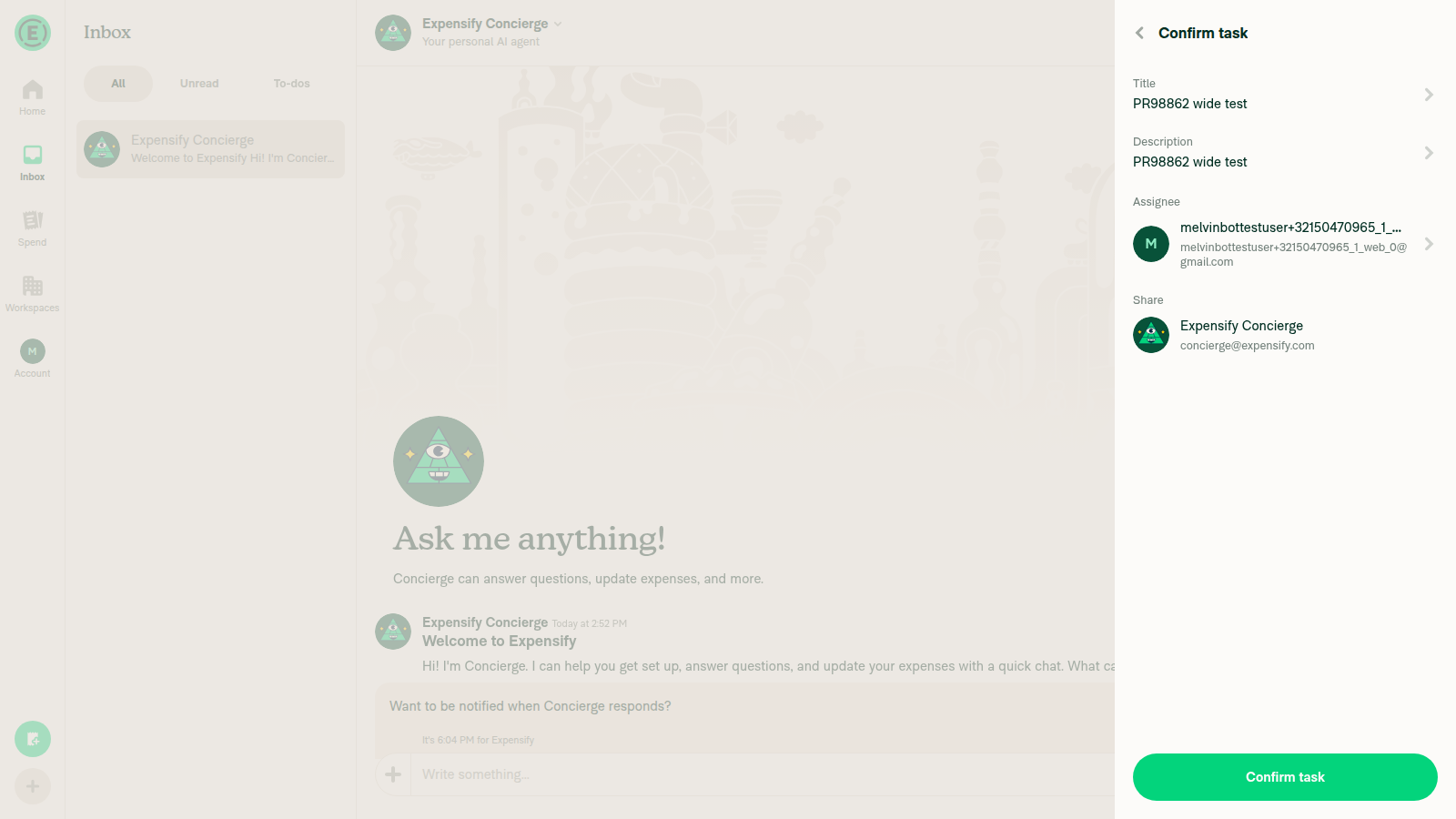
Review — looks solid ✅This is a faithful, well-scoped continuation of the I spot-checked a few behavior-parity concerns and verified two of the migrated rows at runtime on web — both render correctly:
Parity checks I confirmed against the legacy component
Non-blocking notes
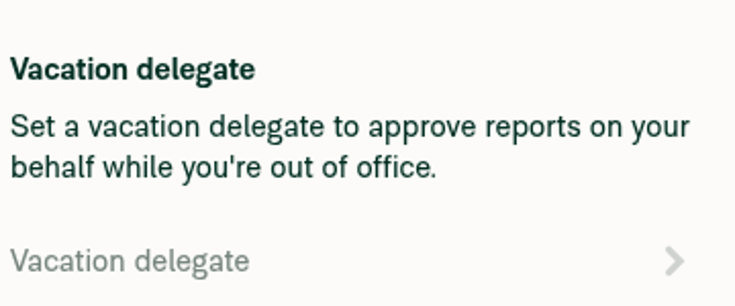
Nothing here blocks. Nice, tidy migration. Runtime verification below. New Task confirm page — migrated Assignee and Share rows (avatar, bold title, supporting line, chevron)Vacation delegate placeholder — single standalone-size line with a chevron |


There was a problem hiding this comment.
good split, and the typography matches legacy where it counts. I checked the placeholder variant against legacy descriptionTextStyles and they are the same.
Two things I would fix before merge. The cardholder avatar in ConfirmationStep now renders the grey fallback instead of the coloured default. And the subscript avatar no longer follows the row's hover state. Everything else is API shape and consistency.
| return; | ||
| <> | ||
| <View style={[styles.ph5, styles.mt2]}> | ||
| <MenuItem.Label>{translate('workspace.invoices.sendFrom')}</MenuItem.Label> |
There was a problem hiding this comment.
MenuItem.Label is outside Root here but inside Root in ScheduleCallConfirmationPage and TaskFieldRow. Both are right: this one matches legacy isLabelHoverable={false}, the others match the default true. But MenuItemLabel's doc only says "The label above a menu item's Row", so nothing records that the placement is what decides whether the label picks up the row's hover background. Worth saying so in the component doc.
There was a problem hiding this comment.
Actually, we decided to always show the label outside the pressable, so I'll fix those usages. Thanks for noticing!

|
@MelvinBot could you double-check that all of my comments in the review are accurate? |
|
Double-checked all three against the source on this branch — all three are accurate. ✅ 1. 2.
3. Subscript avatar no longer follows the row's hover state — accurate.
Net: the two "fix before merge" items are legit regressions, and both are edge/hover states that wouldn't show up in a static side-by-side — nice catches. Neither is a blocker for the split itself. |
|
@MelvinBot there is more than 3 of my comments in the review, I think it is around 14 comments in total, could you double-check that all of my comments in the review are accurate? |
|
I went through all 14 inline comments against the code on this branch. Your two "fix before merge" calls are both real bugs, and 12 of the 14 comments are accurate as written. Two need a correction: the subscript-hover comment reaches the right conclusion via a wrong mechanism, and the Verdict per comment
The two corrections1. Subscript hover (comment) — the seam is real, but not for the reason stated. You wrote that the ready-made 2. One nuance
Bottom lineBoth of your headline "fix before merge" bugs — the cardholder grey avatar and the subscript hover seam — are genuine (I verified the avatar-resolution chain through |
|
I went through all 14 and traced each claim to source on the PR head (
The one that's wrong#12 ( The two with a small imprecision#9 ( #11 ( Notes on a couple of the accurate ones
Net: your review is in good shape. The only substantive correction is #12's direction/number; #9 and #11 each have a one-line inaccuracy that doesn't undermine the suggestion. |
|
I wasn't able to kick off the adhoc builds from here — dispatching workflows is blocked in my environment, so nothing was triggered. Adhoc builds come from the Build and deploy apps for testing workflow (
One heads-up: the workflow gate requires the person dispatching it to be an Expensify employee with write access to |


|
@roryabraham it's all yours |

 roryabraham
left a comment
roryabraham
left a comment
roryabraham
left a comment
There was a problem hiding this comment.
Looking really close, just noticed a couple small things.
# Conflicts:
#	src/components/VacationDelegateMenuItem.tsx

fbba7cc to
0066307
Compare
|
@roryabraham both comments addressed |


|
🚧 roryabraham has triggered a test Expensify/App build. You can view the workflow run here. |

|
✋ This PR was not deployed to staging yet because QA is ongoing. It will be automatically deployed to staging after the next production release. |
|
🧪🧪 Use the links below to test this adhoc build on Android, iOS, and Web. Happy testing! 🧪🧪
|


|
🚀 Deployed to staging by https://github.com/roryabraham in version: 9.4.66-0 🚀
|
|
🤖 No help site changes are required for this PR. I did not create a docs PR. This is Part 2 of the How I checkedI reviewed all 34 changed files against No copy changed. The PR touches zero The only new hardcoded strings are Storybook fixtures. Strings like No behavior or navigation changed. Your own test plan is a side-by-side identity check against Affected surfaces already documented on the help site are unchanged in the UI: Copilot confirmation, vacation delegate, task assignee and share rows, workspace member profile, multifactor authentication revoke, company card assignment, and invoice sender. Each renders the same labels in the same places as before. Since help site articles describe what users see and do — not how components are composed internally — there is nothing to update. If you expected a user-visible change here that I missed, reply with the specific screen and I'll take another look. |

|
@war-in Just to ensure , we don't have to QA this PR |
roryabraham
changed the title

|
I think regression tests are sufficient |
|
🚀 Deployed to staging by https://github.com/roryabraham in version: 9.4.68-0 🚀
|
|
🤖 No help site changes required. I did not create a docs PR. This is an internal component refactor (part 2 of the How I checked1. No copy or translation changes. No 2. No behavior changes. The PR body states it is a component refactor with no API or Onyx changes, and the PR is marked 3. The only new strings are Storybook-only. All the new literal text ( 4. Affected flows already documented correctly. I checked the articles covering the migrated rows — including If a follow-up phase of this decomposition does change a visible label or flow, ping me again and I'll open the docs PR then. |
|
🚀 Deployed to production by https://github.com/francoisl in version: 9.4.68-1 🚀
Bundle Size Analysis (Sentry): |

9 participants


Explanation of Change
Part 2 of the
MenuItemdecomposition — the avatar-led rows. Adds theLeadingandLabelprimitives, a typographyvariantonDescription,testIDonRootand the presets, and aMenuItemEntitypreset, then migrates the avatar call sites.Two notes for reviewers:
MenuItemEntityis deliberately narrow — aUserAvatarplus an always-on chevron. Rows needing a workspace avatar, an ID-drivenReportActionAvatars, or no chevron drop to raw composition rather than growing the preset.MenuItem.Descriptiongained avariant.placeholderreproduces the legacy font bump that happened automatically when a row had notitle, so title-less rows keep rendering at the standalone size.Fixed Issues
$ #99408
PROPOSAL:
Tests
npm run storybookand open theComponents/MenuItemComparisonstoryPhase 2 — avatarssection, theLegacy,ComposableandPresetrenders are identicalPhase 1 — icon rowscards below are still identicalMigrated rows, checked against
mainside by side:Vacation delegateat the larger standalone font sizeAssigneeandSharerows show avatars, labels, tooltips on hover, theRequiredhint whileShareis empty, and the chevronProfilerow still navigates and is spaced from the section belowRevokebutton on the rightSend fromfield shows the workspace avatar, name andWorkspace, and only shows a chevron when the sender can be changedOffline tests
Mostly N/A — a component refactor with no API or Onyx changes. One row keeps offline feedback:
QA Steps
N/A
PR Author Checklist
### Fixed Issuessection aboveTestssectionOffline stepssectionQA stepssectionAvatar, I verified the components usingAvatarare working as expected)StyleUtils.getBackgroundAndBorderStyle(theme.componentBG))npm run compress-svg)Avataris modified, I verified thatAvataris working as expected in all cases)Designlabel and/or tagged@Expensify/designso the design team can review the changes.mainbranch was merged into this PR after a review, I tested again and verified the outcome was still expected according to theTeststeps.Screenshots/Videos
Android: Native
Android: mWeb Chrome
iOS: Native
iOS: mWeb Safari
MacOS: Chrome / Safari