Skip to content

Fix workspace keyboard focus not returning to 3-dot trigger after Back - #97171

Merged
danieldoglas merged 19 commits into
Expensify:mainfrom
Krishna2323:krishna2323/issue/96971
Aug 19, 2026
Merged

danieldoglas merged 19 commits into
Expensify:mainfrom
Krishna2323:krishna2323/issue/96971

Conversation

@Krishna2323

@Krishna2323 Krishna2323 commented Jul 27, 2026 •

Copy link
Copy Markdown
Contributor

Explanation of Change

Fixed Issues

$ #96971
PROPOSAL:

Tests

  1. Using Windows + Chrome, open a workspace under https://new.expensify.com/workspaces
  2. Navigate using TAB and press enter to open one of the flows below:
  3. Workspace 3-dot menu → Duplicate workspace
  4. Workspace 3-dot menu → Delete workspace
  5. Workspace → Overview → Workspace Name
  6. Workspace → Categories → Settings
  7. Navigate to the 'Back' button (or close/cancel) using TAB, press enter to activate
  8. Verify focus returns to the element that triggered the navigation.
  • Verify that no errors appear in the JS console

Offline tests

  • Same as tests

QA Steps

  • Same as tests

  • Verify that no errors appear in the JS console

PR Author Checklist

  • I linked the correct issue in the ### Fixed Issues section above
  • I wrote clear testing steps that cover the changes made in this PR
    • I added steps for local testing in the Tests section
    • I added steps for the expected offline behavior in the Offline steps section
    • I added steps for Staging and/or Production testing in the QA steps section
    • I added steps to cover failure scenarios (i.e. verify an input displays the correct error message if the entered data is not correct)
    • I turned off my network connection and tested it while offline to ensure it matches the expected behavior (i.e. verify the default avatar icon is displayed if app is offline)
    • I tested this PR with a High Traffic account against the staging or production API to ensure there are no regressions (e.g. long loading states that impact usability).
  • I included screenshots or videos for tests on all platforms
  • I ran the tests on all platforms & verified they passed on:
    • Android: Native
    • Android: mWeb Chrome
    • iOS: Native
    • iOS: mWeb Safari
    • MacOS: Chrome / Safari
    • MacOS: Desktop
  • I verified there are no console errors (if there's a console error not related to the PR, report it or open an issue for it to be fixed)
  • I verified there are no new alerts related to the canBeMissing param for useOnyx
  • I followed proper code patterns (see Reviewing the code)
    • I verified that any callback methods that were added or modified are named for what the method does and never what callback they handle (i.e. toggleReport and not onIconClick)
    • I verified that comments were added to code that is not self explanatory
    • I verified that any new or modified comments were clear, correct English, and explained "why" the code was doing something instead of only explaining "what" the code was doing.
    • I verified any copy / text shown in the product is localized by adding it to src/languages/* files and using the translation method
      • If any non-english text was added/modified, I used JaimeGPT to get English > Spanish translation. I then posted it in #expensify-open-source and it was approved by an internal Expensify engineer. Link to Slack message:
    • I verified all numbers, amounts, dates and phone numbers shown in the product are using the localization methods
    • I verified any copy / text that was added to the app is grammatically correct in English. It adheres to proper capitalization guidelines (note: only the first word of header/labels should be capitalized), and is either coming verbatim from figma or has been approved by marketing (in order to get marketing approval, ask the Bug Zero team member to add the Waiting for copy label to the issue)
    • I verified proper file naming conventions were followed for any new files or renamed files. All non-platform specific files are named after what they export and are not named "index.js". All platform-specific files are named for the platform the code supports as outlined in the README.
    • I verified the JSDocs style guidelines (in STYLE.md) were followed
  • If a new code pattern is added I verified it was agreed to be used by multiple Expensify engineers
  • I followed the guidelines as stated in the Review Guidelines
  • I tested other components that can be impacted by my changes (i.e. if the PR modifies a shared library or component like Avatar, I verified the components using Avatar are working as expected)
  • I verified all code is DRY (the PR doesn't include any logic written more than once, with the exception of tests)
  • I verified any variables that can be defined as constants (ie. in CONST.ts or at the top of the file that uses the constant) are defined as such
  • I verified that if a function's arguments changed that all usages have also been updated correctly
  • If any new file was added I verified that:
    • The file has a description of what it does and/or why is needed at the top of the file if the code is not self explanatory
  • If a new CSS style is added I verified that:
    • A similar style doesn't already exist
    • The style can't be created with an existing StyleUtils function (i.e. StyleUtils.getBackgroundAndBorderStyle(theme.componentBG))
  • If new assets were added or existing ones were modified, I verified that:
    • The assets are optimized and compressed (for SVG files, run npm run compress-svg)
    • The assets load correctly across all supported platforms.
  • If the PR modifies code that runs when editing or sending messages, I tested and verified there is no unexpected behavior for all supported markdown - URLs, single line code, code blocks, quotes, headings, bold, strikethrough, and italic.
  • If the PR modifies a generic component, I tested and verified that those changes do not break usages of that component in the rest of the App (i.e. if a shared library or component like Avatar is modified, I verified that Avatar is working as expected in all cases)
  • If the PR modifies a component related to any of the existing Storybook stories, I tested and verified all stories for that component are still working as expected.
  • If the PR modifies a component or page that can be accessed by a direct deeplink, I verified that the code functions as expected when the deeplink is used - from a logged in and logged out account.
  • If the PR modifies the UI (e.g. new buttons, new UI components, changing the padding/spacing/sizing, moving components, etc) or modifies the form input styles:
    • I verified that all the inputs inside a form are aligned with each other.
    • I added Design label and/or tagged @Expensify/design so the design team can review the changes.
  • If a new page is added, I verified it's using the ScrollView component to make it scrollable when more elements are added to the page.
  • I added unit tests for any new feature or bug fix in this PR to help automatically prevent regressions in this user flow.
  • If the main branch was merged into this PR after a review, I tested again and verified the outcome was still expected according to the Test steps.

Screenshots/Videos

Android: Native
Android: mWeb Chrome
iOS: Native
iOS: mWeb Safari
MacOS: Chrome / Safari
web_chrome_mac.mp4
web_chrome_windows.mp4
Monosnap.screencast.2026-08-18.19-50-46.mp4

Signed-off-by: krishna2323 <belivethatkg@gmail.com>
@codecov

codecov Bot commented Jul 27, 2026 •

Copy link
Copy Markdown

Codecov Report

✅ Changes either increased or maintained existing code coverage, great job!

Files with missing lines Coverage Δ
src/components/PopoverMenu/index.tsx 91.48% <100.00%> (ø)
src/components/ThreeDotsMenu/index.tsx 94.20% <ø> (ø)
... and 49 files with indirect coverage changes

Signed-off-by: krishna2323 <belivethatkg@gmail.com>
@Krishna2323

Copy link
Copy Markdown
Contributor Author

@MelvinBot review

@MelvinBot

Copy link
Copy Markdown
Contributor

Review

Overall this is a solid, well-reasoned change — the LauncherStack registration + shouldCallAfterModalHide handshake is a clean way to bridge the "anchor blurred before the trap activates" gap, and the tests and inline comments are genuinely good. A few things worth a second look before this ships:

1. Blast radius on shared components (main concern). ThreeDotsMenu/index.tsx and FocusTrapForModal/index.web.tsx are used app-wide (~19 ThreeDotsMenu call sites, plus every PopoverMenu/modal goes through FocusTrapForModal). Two behaviors now change globally, not just for workspaces:

  • onThreeDotsPress always registers the anchor into LauncherStack before blur.
  • onActivate now falls back to pickLauncher() whenever document.activeElement is body, for every trap.

The registration looks self-cleaning (PopoverMenu renders FocusTrapForModal, whose onPostDeactivate marks the entry deactivated, and setActivePopoverLauncher dedupes by element), so I don't see a leak. But the Tests/QA steps only cover the 4 workspace flows. Please spot-check a couple of unrelated high-traffic ThreeDotsMenu + modal flows (e.g. report-header 3-dot menu, money-request, search) to confirm focus still returns where expected and nothing jumps to a stale anchor — that's where a regression would hide.

2. onActivate pickLauncher fallback in trigger-less modals. With the new fallback, a modal opened while nothing is focused (activeElement === body) will now capture a recently-used launcher from the stack and return focus to it on close, where previously it captured nothing. This is usually the desired behavior, but it's a new focus-return path for modals that never had one — worth confirming it doesn't surprise anywhere (part of the spot-check above).

3. Coverage on the new onModalHide restore branch. Codecov flags ThreeDotsMenu down ~4.6%; the uncovered lines are the new onModalHide anchor-restore path and the shouldCallAfterModalHide branch in onItemSelected. Since that handshake is the core of the fix, a small unit test asserting the anchor regains focus on hide (and that restoreFocusType stays PRESERVE in the non-deferred branch) would lock it in.

Minor / nits

  • The delete item's shouldCallAfterModalHide: !shouldCalculateBillNewDot || wouldBlockDeletion and the Leave/Transfer items already use this flag, so the confirm-modal flows look covered — good.
  • FocusTrapForModal swapping launcher !== document.body for document.contains(launcher) is a safe, strictly-better guard (both fromActive and pickLauncher() already exclude body).
  • The useAutoFocusInput swap in the Name/Description pages is a nice cleanup and should improve native too, not just web.

Nothing here is a blocker on the approach — the design is sound. The asks are really about confirming the shared-component changes don't ripple into other flows, plus a test on the new hide-restore branch.

Signed-off-by: krishna2323 <belivethatkg@gmail.com>
@Krishna2323
Krishna2323 marked this pull request as ready for review July 28, 2026 14:11
@Krishna2323
Krishna2323 requested review from a team as code owners July 28, 2026 14:11
@melvin-bot
melvin-bot Bot requested review from heyjennahay and mkhutornyi and removed request for a team and heyjennahay July 28, 2026 14:11
@melvin-bot

melvin-bot Bot commented Jul 28, 2026

Copy link
Copy Markdown

@mkhutornyi Please copy/paste the Reviewer Checklist from here into a new comment on this PR and complete it. If you have the K2 extension, you can simply click: [this button]

@melvin-bot
melvin-bot Bot removed the request for review from a team July 28, 2026 14:11
Signed-off-by: krishna2323 <belivethatkg@gmail.com>

@chatgpt-codex-connector chatgpt-codex-connector Bot left a comment

Copy link
Copy Markdown

Choose a reason for hiding this comment

The reason will be displayed to describe this comment to others. Learn more.

💡 Codex Review

Here are some automated review suggestions for this pull request.

Reviewed commit: b25fd3c0a2

ℹ️ About Codex in GitHub

Your team has set up Codex to review pull requests in this repo. Reviews are triggered when you

  • Open a pull request for review
  • Mark a draft as ready
  • Comment "@codex review".

If Codex has suggestions, it will comment; otherwise it will react with 👍.

Codex can also answer questions or update the PR. Try commenting "@codex address that feedback".

Comment thread src/components/FocusTrap/FocusTrapForModal/index.web.tsx Outdated
Signed-off-by: krishna2323 <belivethatkg@gmail.com>
@Krishna2323

Copy link
Copy Markdown
Contributor Author

@codex review

@Krishna2323

Copy link
Copy Markdown
Contributor Author

@MelvinBot review

@MelvinBot

Copy link
Copy Markdown
Contributor

Review

Solid, well-scoped accessibility fix with strong test coverage (4 test files, pure resolveFocusTrapLauncher is nicely unit-testable). The launcher-registration approach is the right, higher-leverage fix. Code reads clearly and the "why" comments are genuinely helpful. I found no blocking bugs, but two behavior changes are global (they affect every modal, not just the workspace flows in scope), and one platform gap is worth confirming before merge.

1. pickLauncher() fallback now applies to every FocusTrapForModal, not just ThreeDots

In FocusTrapForModal/index.web.tsx:31, when document.activeElement is body (nothing focused) and no focus is inside the trap, onActivate now falls back to pickLauncher() — the most-recent stacked launcher, active or deactivated within LAUNCHER_CLEAR_DELAY_MS. Previously this case captured nothing.

That's exactly what fixes the ThreeDots pre-blur case, but it changes capture behavior for all modals built on FocusTrapForModal. A modal opened programmatically while focus is on body, shortly after an unrelated popover closed, could now adopt that popover's still-in-DOM launcher and restore focus there on close. It's bounded by the document.contains checks and the clear-delay window, so the blast radius is small — but it's the main thing to regression-test beyond the 4 workspace flows (e.g. confirm a plain modal opened with no prior focus doesn't inherit a stale launcher). Worth a sanity pass.

2. Safari path for shouldCallAfterModalHide

The handshake relies on PopoverMenu deferring onSelected until after onModalHide re-focuses the anchor. But PopoverMenu/index.tsx:421 disables that deferral on Safari (!isSafari() || shouldAvoidSafariException), and ThreeDotsMenu does not pass shouldAvoidSafariException. On Safari, onSelected (navigate) fires immediately, while onItemSelected set shouldRestoreAnchorOnHideRef = true but deliberately did not set PRESERVE — so the anchor re-focus lands in onModalHide after navigation already happened. The linked issue is scoped to Windows + Chrome, so this may be acceptable, but the PR checklist claims all-platform testing — please confirm Duplicate/Categories→Settings Back-focus still returns correctly (and without a focus flash) on iOS/macOS Safari.

3. Global <View style={dContents}> wrapper

Every FocusTrapForModal child is now wrapped in a display: contents View. dContents is an existing utility and display:contents is layout-neutral, so this is low-risk — just flagging that it's a global structural change to all modals, not just these flows. If anything downstream assumed the trap child was a direct DOM child it could be affected; a quick scan of other modal consumers would put it to bed.

Things I checked that look correct
  • resolveFocusTrapLauncher logic (resolveFocusTrapLauncher.ts:13) — nested-trap case (focus already inside container → keep activeStacked) and new-nested-modal case (opener outside container → use fromActive) both resolve correctly. This also correctly addresses the Codex bot's earlier concern about overwriting the pre-registered trigger with the transient menu item.
  • LauncherStack split — pickActiveLauncher (active-only) vs pickLauncher (active-first, then recently-deactivated) is clean; the DOM-contains pruning still runs.
  • WorkspaceOverviewDescriptionPage ref callback — the !inputRef.current guard runs before inputCallbackRef sets the ref, preserving the once-only updateMultilineInputRange init. Equivalent to (or better than) the old isInputInitializedRef.
  • onActivate still captures the launcher regardless of shouldReturnFocus (only onPostDeactivate gates restore on it) — matches the prior intent even though the explanatory comment was dropped.

Next Steps: Reply with @MelvinBot <feedback> to refine this review. I wasn't able to run the unit suite in this environment, so I confirmed the logic by reading rather than by executing the tests — worth a local npx jest on the four touched test files before merge.

@chatgpt-codex-connector chatgpt-codex-connector Bot left a comment

Copy link
Copy Markdown

Choose a reason for hiding this comment

The reason will be displayed to describe this comment to others. Learn more.

💡 Codex Review

Here are some automated review suggestions for this pull request.

Reviewed commit: cff41306b1

ℹ️ About Codex in GitHub

Your team has set up Codex to review pull requests in this repo. Reviews are triggered when you

  • Open a pull request for review
  • Mark a draft as ready
  • Comment "@codex review".

If Codex has suggestions, it will comment; otherwise it will react with 👍.

Codex can also answer questions or update the PR. Try commenting "@codex address that feedback".

Comment thread src/components/ThreeDotsMenu/index.tsx Outdated
Comment thread src/components/FocusTrap/FocusTrapForModal/index.web.tsx Outdated
Signed-off-by: krishna2323 <belivethatkg@gmail.com>
@Krishna2323

Copy link
Copy Markdown
Contributor Author

@MelvinBot review

@MelvinBot

Copy link
Copy Markdown
Contributor

Review

Re-reviewed at e89efd9. The design holds up — registering the anchor in LauncherStack at open time and using the shouldCallAfterModalHide handshake to re-focus it before the deferred onSelected is the right, higher-leverage fix, and it's now applied consistently to both ThreeDotsMenu and ButtonWithDropdownMenu. I verified the referenced symbols resolve (dContents, isSafari, BaseModalProps.restoreFocusType, restoreFocusWithModality) and re-checked the resolveFocusTrapLauncher branch logic — internally consistent. No blocking bugs found. Two items remain before merge:

1. One load-bearing assumption is not covered by the unit tests. The whole fix depends on the Modal firing onModalHide (which re-focuses the anchor) before it runs the deferred shouldCallAfterModalHide onSelected (the navigate). But the new ThreeDotsMenuFocusRestoreTest / ButtonWithDropdownMenuFocusRestoreTest both mock PopoverMenu and drive onItemSelected → onModalHide by hand. So they prove the components arm the ref correctly, but not that Modal/PopoverMenu actually orders those two callbacks the way the comments claim. That ordering is exactly what breaks the Back-focus return if it ever regresses, and it's only covered by manual QA — worth calling out so a future refactor of the modal-hide sequence doesn't silently break this.

2. Shared-component blast radius still needs a manual sanity pass (carried over from the earlier reviews, still the main gate). Two behaviors now change for every consumer, not just the 4 workspace flows in the Tests section:

  • onThreeDotsPress always registers the anchor into LauncherStack before blur.
  • FocusTrapForModal.onActivate now falls back to pickLauncher() whenever document.activeElement === body, for every trap (index.web.tsx:31).

The registration looks self-cleaning (onPostDeactivate → markActivePopoverLauncherDeactivated, and setActivePopoverLauncher dedupes by element) and the fallback is bounded by document.contains + LAUNCHER_CLEAR_DELAY_MS, so I don't see a leak or a stale-anchor hazard on paper. But please spot-check a couple of unrelated high-traffic surfaces — a report-header 3-dot menu and any plain modal opened while nothing is focused — to confirm Back/close focus still lands where expected and no modal inherits a stale launcher.

Things I checked that look correct
  • All open paths register the launcher in ButtonWithDropdownMenu — handlePress, onPressChevron, and the split-button cart-icon onPress all route through toggleMenuVisible → setMenuVisible(true) → registerDropdownLauncher, and the imperative setIsMenuVisible handle is now setMenuVisible too.
  • shouldRestoreAnchorOnHideRef lifecycle — armed only on the deferred branch, consumed-and-reset in onModalHide; the outside-click/escape close path leaves it false, so no spurious re-focus.
  • Safari path — non-deferred branch sets PRESERVE; the anchor is still recoverable for Back via LauncherStack (covered by the new NavigationFocusReturnTest case), so this shouldn't regress even though onSelected fires immediately.
  • resolveFocusTrapLauncher — nested-trap (focus already inside container → keep activeStacked) vs new-nested-modal (opener outside container → fromActive) both resolve correctly; unit-tested in resolveFocusTrapLauncherTest.
  • useAutoFocusInput swap in the Name/Description pages — the !inputRef.current guard runs before inputCallbackRef sets the ref, preserving the once-only updateMultilineInputRange init.
  • document.contains(launcher) guard replacing launcher !== document.body is strictly safer.

Note: I could not execute the Jest suite in this environment, so the above is from reading the code, not from a green test run. Please confirm a local npx jest on the five touched test files passes before merge.


Next Steps: Reply with @MelvinBot <feedback> to refine this review.

Signed-off-by: krishna2323 <belivethatkg@gmail.com>
@JS00001

JS00001 commented Aug 18, 2026

Copy link
Copy Markdown
Contributor

@JS00001 JS00001 closed this Aug 18, 2026
@JS00001 JS00001 reopened this Aug 18, 2026
Signed-off-by: krishna2323 <belivethatkg@gmail.com>
@Krishna2323

Copy link
Copy Markdown
Contributor Author

@MelvinBot review

@Krishna2323

Copy link
Copy Markdown
Contributor Author

@mkhutornyi fixed the popover close with esc case:

Monosnap.screencast.2026-08-18.19-50-46.mp4

@MelvinBot

Copy link
Copy Markdown
Contributor

Review (at ccf49bd)

Much tighter than the earlier version — reverting to just the onModalHide dismiss-refocus (plus the small resolvePopoverLauncherElement helper) is the right call now that #97678 handles the select→navigate→Back case. The approach reads cleanly and the "why" comment on the fallback is genuinely useful. One real edge-case bug, plus a test-coverage gap, before this ships.

1. wasItemSelectedRef gets stuck true for keep-open items (the Delete-workspace flow this PR targets)

onItemSelected sets wasItemSelectedRef.current = true unconditionally, but hidePopoverMenu early-returns (menu stays open) when the item has shouldKeepModalOpen or shouldCloseModalOnSelect === false. So for a keep-open item:

  1. User selects it → wasItemSelectedRef = true, but the menu does not close (onModalHide never fires).
  2. User then dismisses the still-open menu (Escape / click outside) → onModalHide runs with the ref still true → it returns early and never refocuses the anchor.

This isn't hypothetical — WorkspaceRowThreeDotsMenu.tsx:153 sets shouldKeepModalOpen: shouldCalculateBillNewDot && !wouldBlockDeletion on the Delete item, which is exactly the workspace 3-dot flow this PR is fixing. When bill calc applies, tapping Delete then dismissing the menu reproduces the original bug the fix is meant to close.

Fix: only arm the ref when the modal will actually close, mirroring the hidePopoverMenu guard:

onItemSelected={(item) => {
    if (!item?.shouldKeepModalOpen && item?.shouldCloseModalOnSelect !== false) {
        wasItemSelectedRef.current = true;
        setRestoreFocusType(CONST.MODAL.RESTORE_FOCUS_TYPE.PRESERVE);
    }
    hidePopoverMenu(item);
}}

2. The new unit test doesn't cover the new production code

The added NavigationFocusReturnTest case exercises LauncherStack's captureTriggerForRoute/restoreTriggerForRoute and manually calls setActivePopoverLauncher. But this PR's production diff never touches LauncherStack and ThreeDotsMenu doesn't register a launcher there — so the test protects a path owned by other code, not the new onModalHide dismiss-refocus. The actual new behavior (dismiss → restoreFocusWithModality(anchor)) has no dedicated test. Worth a small test that mounts ThreeDotsMenu, opens it, dismisses without selecting, and asserts the anchor regains focus (and — covering finding #1 — that a keep-open selection followed by a dismiss still refocuses).

Looks correct

  • resolvePopoverLauncherElement — instanceof HTMLElement + document.contains is a clean, native-safe guard; the View ref is the host node on web, so no cast needed.
  • restoreFocusWithModality pause/unpause dance is the right tool to stop the closing trap from yanking focus back.
  • The item-selected path correctly hands off to PRESERVE + the item's own action, so it stays out of the way of navigation focus return.
Live web spot-check (agent-device, web)

Couldn't exercise the workspace-row 3-dot flow directly — the test account has no workspaces (creating one would be seeding data, out of scope for verify-only). Spot-checked an unrelated popover instead: it opened, dismissed cleanly via click-outside, reopened without any stuck/inert state, and the app stayed fully interactive across two cycles — no regression. As in prior runs, the precise "focus lands on the trigger" assertion is not machine-verifiable on web (the driver exposes no document.activeElement/focus state), so the WCAG 2.4.3 return-to-trigger claim still needs a human keyboard-only pass (Tab → Enter → Escape/click-out → eyeball the ring) on Windows + Chrome, plus the iOS/macOS Safari confirmation.

Unrelated popover open (spot-check)

Next Steps: Reply with @MelvinBot <feedback> to refine this review.

@mkhutornyi

Copy link
Copy Markdown
Contributor

Please check if this solution makes sense:

Also return focus to the ⋯ trigger when a popover menu is dismissed

ThreeDotsMenu sets shouldEnableNewFocusManagement, and PopoverMenu turns that straight into shouldReturnFocus={!shouldEnableNewFocusManagement}, so the focus trap never returns focus, on the assumption that ComposerFocusManager will.
It can't: getActiveInput() only ever returns a TextInput, and onThreeDotsPress blurs the button before opening, so nothing is saved and nothing is restored.
Dismissing a ⋯ menu leaves focus on <body>, and the next Tab restarts from the top of the page.

This makes the derived value an overridable default and opts ThreeDotsMenu in.
Omitting the prop reproduces the old expression exactly, so every other caller is unchanged. It's threaded to both traps a popover menu can produce, because which one exists depends on withoutOverlay three components up: with an overlay the popover renders through <Modal> → ReanimatedModal's trap; without one it renders through PopoverWithoutOverlay, a plain View where BasePopoverMenu's own trap is the only one.

diff --git a/src/components/PopoverMenu/index.tsx b/src/components/PopoverMenu/index.tsx
index 23e6a776883..3f9c789b9d5 100644
--- a/src/components/PopoverMenu/index.tsx
+++ b/src/components/PopoverMenu/index.tsx
@@ -154,6 +154,13 @@ type PopoverMenuProps = Partial<ModalAnimationProps> & {
      * */
     shouldEnableNewFocusManagement?: boolean;
 
+    /**
+     * Whether to return focus to the trigger when the menu is dismissed without navigating.
+     * Defaults to the inverse of `shouldEnableNewFocusManagement`, because that manager owns the restore when it is on.
+     * Set it explicitly for a trigger the manager cannot restore — it only tracks text inputs, so a button is left with nothing to return to.
+     */
+    shouldReturnFocus?: boolean;
+
     /** How to re-focus after the modal is dismissed */
     restoreFocusType?: BaseModalProps['restoreFocusType'];
 
@@ -326,6 +333,7 @@ function BasePopoverMenu({
     withoutOverlay = false,
     shouldSetModalVisibility = true,
     shouldEnableNewFocusManagement,
+    shouldReturnFocus,
     restoreFocusType,
     shouldShowRadioButton = false,
     containerStyles,
@@ -699,6 +707,7 @@ function BasePopoverMenu({
             withoutOverlay={withoutOverlay}
             shouldSetModalVisibility={shouldSetModalVisibility}
             shouldEnableNewFocusManagement={shouldEnableNewFocusManagement}
+            shouldReturnFocus={shouldReturnFocus}
             restoreFocusType={restoreFocusType}
             innerContainerStyle={{...styles.pv0, ...innerContainerStyle}}
             shouldUseModalPaddingStyle={shouldUseModalPaddingStyle}
@@ -709,7 +718,7 @@ function BasePopoverMenu({
         >
             <FocusTrapForModal
                 active={isVisible}
-                shouldReturnFocus={!shouldEnableNewFocusManagement}
+                shouldReturnFocus={shouldReturnFocus ?? !shouldEnableNewFocusManagement}
                 launcherRef={anchorRef}
             >
                 <CompactMenuContext.Provider value>
diff --git a/src/components/ThreeDotsMenu/index.tsx b/src/components/ThreeDotsMenu/index.tsx
index 5245e35be92..261aa98a6ee 100644
--- a/src/components/ThreeDotsMenu/index.tsx
+++ b/src/components/ThreeDotsMenu/index.tsx
@@ -215,6 +215,8 @@ function ThreeDotsMenu({
                 shouldSetModalVisibility={shouldSetModalVisibility}
                 anchorRef={buttonRef}
                 shouldEnableNewFocusManagement
+                // The button blurs itself before opening and is not a text input, so ComposerFocusManager has nothing to restore — the trap has to return focus.
+                shouldReturnFocus
                 restoreFocusType={restoreFocusType}
                 enableEdgeToEdgeBottomSafeAreaPadding
             />

cc: @MelvinBot which solution is better? This one vs PR changes

@MelvinBot

Copy link
Copy Markdown
Contributor

Your shouldReturnFocus approach makes sense and I'd favor it over the current PR's onModalHide handler — it's the more idiomatic fix because it re-enables a restore path that already exists and is fully guarded, rather than adding a parallel one.

Why the shouldReturnFocus approach is better

FocusTrapForModal.onFocusTrapPostDeactivate already calls restoreFocusWithModality(launcher) on dismiss — the launcher is the same anchor the current PR resolves, and it's captured on activate via setActivePopoverLauncher. It's just gated off by shouldReturnFocus={!shouldEnableNewFocusManagement}, which ThreeDotsMenu turns off. So flipping that gate for ThreeDotsMenu is exactly the fix, and you inherit all the guards the current PR's handler doesn't have:

  • wasClaimedByNavigation (L62) — the select→navigate→Back case is handed to NavigationFocusReturn and not double-restored.
  • isCoveredByNewerTrap — a confirm modal opened on top of the menu won't yank the ring back to the trigger.
  • ReportActionComposeFocusManager.isFocused() + document.contains(launcher) guards.

Two concrete wins over the current PR:

  1. It avoids a real bug in the current onModalHide approach. onItemSelected arms wasItemSelectedRef unconditionally, but hidePopoverMenu keeps the menu open for shouldKeepModalOpen/shouldCloseModalOnSelect === false items (e.g. the Delete item in WorkspaceRowThreeDotsMenu.tsx:153). Selecting such an item then dismissing leaves the ref stuck true, so onModalHide skips the refocus. The trap approach keys off wasClaimedByNavigation, which is accurate, so it doesn't have this hole.
  2. It removes duplication. The PR's new resolvePopoverLauncherElement is a near-identical copy of resolveLauncherElement already inside FocusTrapForModal, and its manual restoreFocusWithModality re-implements the trap's own restore.

It's also consistent with the codebase: ReanimatedModal already uses shouldReturnFocus ?? !shouldEnableNewFocusManagement, so your default-and-override is the pattern already in place for the overlay path.

Things to confirm before adopting it

  • Prop plumbing works, with a small type add. For the overlay path (shouldOverlay callers), PopoverWithMeasuredContent → Popover → Modal all spread {...props}, and BaseModal/ReanimatedModal consume shouldReturnFocus, so the value reaches the modal's trap. But shouldReturnFocus needs to be added to PopoverWithMeasuredContent's props type or the explicit shouldReturnFocus={shouldReturnFocus} on that element won't typecheck. The default ThreeDotsMenu (withoutOverlay=true) uses BasePopoverMenu's own trap, which your L718 change covers directly.
  • Keep the existing restoreFocusType/PRESERVE handling for the item-selected path — that's orthogonal to shouldReturnFocus and still wanted so a navigating selection doesn't fight the trap.
  • Same manual keyboard QA still applies (Tab → Enter to open, Escape / Tab-to-Back → Enter, eyeball the ring) on Windows + Chrome, plus iOS/macOS Safari — the return-to-trigger assertion isn't machine-verifiable on the web driver, so it needs a human pass regardless of which approach ships.

Net: your approach is the cleaner, lower-risk fix (omitting the prop reproduces old behavior exactly), and it sidesteps the keep-open-item bug in the current onModalHide version. I'd go with it.


Next Steps: Reply with @MelvinBot <feedback> to refine this.

Signed-off-by: krishna2323 <belivethatkg@gmail.com>
@Krishna2323

Copy link
Copy Markdown
Contributor Author

@mkhutornyi updated.

@chatgpt-codex-connector

Copy link
Copy Markdown

Codex Review: Didn't find any major issues. You're on a roll.

Reviewed commit: c6a429a17f

ℹ️ About Codex in GitHub

Codex has been enabled to automatically review pull requests in this repo. Reviews are triggered when you

  • Open a pull request for review
  • Mark a draft as ready
  • Comment "@codex review".

If Codex has suggestions, it will comment; otherwise it will react with 👍.

When you sign up for Codex through ChatGPT, Codex can also answer questions or update the PR, like "@codex address that feedback".

@MelvinBot

Copy link
Copy Markdown
Contributor

Review (re-review at c6a429a)

Nice rework — dropping the wasItemSelectedRef/custom onModalHide in favor of a shouldReturnFocus prop that delegates to FocusTrapForModal is a real improvement. It fully resolves my earlier finding: the stuck-true ref for shouldKeepModalOpen items is gone, and reusing the trap's onPostDeactivate means the wasClaimedByNavigation / isCoveredByNewerTrap / ComposerFocusManager.isFocused() guards now handle the select-navigate, nested-modal, and keep-open cases for free. The new PopoverMenuFocusReturnTest also closes the wiring/default-derivation coverage gap I flagged. No blocking bug found. One subtlety to confirm before merge:

shouldReturnFocus is now threaded into two nested traps — confirm it's intentional

shouldReturnFocus is passed both to the modal via PopoverMenu/index.tsx:710 and to PopoverMenu's explicit inner FocusTrapForModal at :721. The modal path is not inert: BaseModal forwards it to ReanimatedModal's own FocusTrapForModal. So a PopoverMenu's children are wrapped in two active traps, and for the ThreeDots opt-in both now have shouldReturnFocus === true and both run onPostDeactivate → restoreFocusWithModality.

The difference between them is the launcher: the inner trap has launcherRef={anchorRef} (the ⋯ button), while the modal's trap gets no launcherRef on the desktop/popover path (PopoverMenu passes anchorRef, not launcherRef, and only the bottom-docked branch maps it) — so it falls back to pickLauncher(). In practice the LauncherStack dedup + document.contains guards likely make both resolve to the same anchor and the second restore a no-op, so I don't think this is a live bug. But it's worth confirming this wasn't meant to be scoped to just the inner trap: if the fix works via the inner FocusTrapForModal alone (which has the correct anchor), dropping the :710 passthrough would remove the "modal trap restores via pickLauncher()" path entirely and avoid any double-restore / stale-launcher edge. Either confirm the passthrough is needed, or scope shouldReturnFocus to the inner trap.

The one thing this can't settle from code is the actual keyboard outcome — please do a human keyboard-only pass (Tab → Enter to open, Escape / click-out to dismiss) on Windows + Chrome and confirm focus lands back on the ⋯ trigger exactly once, and that selecting a navigating item still lands focus on the destination (not yanked back to the trigger).

Live smoke-test — could not run this round

The web session went to a blank page (0 accessible nodes, empty network capture) shortly after the CI prestart handoff — an infra/session issue unrelated to this PR's code (the dev server and bundles served HTTP 200 fine). So this re-review is read-verified only; the keyboard QA above still needs a human.


Next Steps: Reply with @MelvinBot <feedback> to refine this review.

@mkhutornyi

Copy link
Copy Markdown
Contributor

Reviewer Checklist

  • I have verified the author checklist is complete (all boxes are checked off).
  • I verified the correct issue is linked in the ### Fixed Issues section above
  • I verified testing steps are clear and they cover the changes made in this PR
    • I verified the steps for local testing are in the Tests section
    • I verified the steps for Staging and/or Production testing are in the QA steps section
    • I verified the steps cover any possible failure scenarios (i.e. verify an input displays the correct error message if the entered data is not correct)
    • I turned off my network connection and tested it while offline to ensure it matches the expected behavior (i.e. verify the default avatar icon is displayed if app is offline)
  • I checked that screenshots or videos are included for tests on all platforms
  • I included screenshots or videos for tests on all platforms
  • I verified that the composer does not automatically focus or open the keyboard on mobile unless explicitly intended. This includes checking that returning the app from the background does not unexpectedly open the keyboard.
  • I verified tests pass on all platforms & I tested again on:
    • Android: HybridApp
    • Android: mWeb Chrome
    • iOS: HybridApp
    • iOS: mWeb Safari
    • MacOS: Chrome / Safari
  • If there are any errors in the console that are unrelated to this PR, I either fixed them (preferred) or linked to where I reported them in Slack
  • I verified proper code patterns were followed (see Reviewing the code)
    • I verified that any callback methods that were added or modified are named for what the method does and never what callback they handle (i.e. toggleReport and not onIconClick).
    • I verified that comments were added to code that is not self explanatory
    • I verified that any new or modified comments were clear, correct English, and explained "why" the code was doing something instead of only explaining "what" the code was doing.
    • I verified any copy / text that was added to the app is grammatically correct in English. It adheres to proper capitalization guidelines (note: only the first word of header/labels should be capitalized), and is either coming verbatim from figma or has been approved by marketing (in order to get marketing approval, ask the Bug Zero team member to add the Waiting for copy label to the issue)
  • If a new code pattern is added I verified it was agreed to be used by multiple Expensify engineers
  • I verified that this PR follows the guidelines as stated in the Review Guidelines
  • I verified other components that can be impacted by these changes have been tested, and I retested again (i.e. if the PR modifies a shared library or component like Avatar, I verified the components using Avatar have been tested & I retested again)
  • If a new component is created I verified that:
    • A similar component doesn't exist in the codebase
    • All props are defined accurately and each prop has a /** comment above it */
    • The file is named correctly
    • The component has a clear name that is non-ambiguous and the purpose of the component can be inferred from the name alone
    • The only data being stored in the state is data necessary for rendering and nothing else
    • For Class Components, any internal methods passed to components event handlers are bound to this properly so there are no scoping issues (i.e. for onClick={this.submit} the method this.submit should be bound to this in the constructor)
    • Any internal methods bound to this are necessary to be bound (i.e. avoid this.submit = this.submit.bind(this); if this.submit is never passed to a component event handler like onClick)
    • All JSX used for rendering exists in the render method
    • The component has the minimum amount of code necessary for its purpose, and it is broken down into smaller components in order to separate concerns and functions
  • If any new file was added I verified that:
    • The file has a description of what it does and/or why is needed at the top of the file if the code is not self explanatory
  • If a new CSS style is added I verified that:
    • A similar style doesn't already exist
    • The style can't be created with an existing StyleUtils function (i.e. StyleUtils.getBackgroundAndBorderStyle(theme.componentBG)
  • If the PR modifies code that runs when editing or sending messages, I tested and verified there is no unexpected behavior for all supported markdown - URLs, single line code, code blocks, quotes, headings, bold, strikethrough, and italic.
  • If the PR modifies a generic component, I tested and verified that those changes do not break usages of that component in the rest of the App (i.e. if a shared library or component like Avatar is modified, I verified that Avatar is working as expected in all cases)
  • If the PR modifies a component related to any of the existing Storybook stories, I tested and verified all stories for that component are still working as expected.
  • If the PR modifies a component or page that can be accessed by a direct deeplink, I verified that the code functions as expected when the deeplink is used - from a logged in and logged out account.
  • If the PR modifies the UI (e.g. new buttons, new UI components, changing the padding/spacing/sizing, moving components, etc) or modifies the form input styles:
    • I verified that all the inputs inside a form are aligned with each other.
    • I added Design label and/or tagged @Expensify/design so the design team can review the changes.
  • For any bug fix or new feature in this PR, I verified that sufficient unit tests are included to prevent regressions in this flow.
  • If the main branch was merged into this PR after a review, I tested again and verified the outcome was still expected according to the Test steps.
  • I have checked off every checkbox in the PR reviewer checklist, including those that don't apply to this PR.

Screenshots/Videos

Android: HybridApp
Android: mWeb Chrome
iOS: HybridApp
iOS: mWeb Safari
MacOS: Chrome / Safari
Screen.Recording.2026-08-18.at.8.25.06.PM.mov

@MelvinBot

Copy link
Copy Markdown
Contributor

Regression hunt (at ccf49bd)

No confirmed runtime regression — a live web run across unrelated ThreeDotsMenu surfaces (workspace More menu) and the global + FAB stayed fully interactive: click-outside dismiss closed cleanly, an underlying input still accepted typing right after, select→Back returned cleanly, and menus reopened with no stuck/inert state. But the fix widens the blast radius of the new force-refocus, and there are 2 code-level regression candidates I could not rule out because the web driver can't read document.activeElement/focus rings. Both are worth a targeted human keyboard check before merge.

1. Force-refocus now fires on auto-hide, not just user dismissal (main concern)

onModalHide calls restoreFocusWithModality(anchor) on every close where an item wasn't selected. But the popover's isVisible flips to false — firing onModalHide — in two cases that are not user dismissals, and now each yanks focus to the 3-dot trigger where before it moved no focus:

  • isBehindModal (willAlertModalBecomeVisible): an alert modal opening over an open menu auto-hides it → focus is now pushed to the trigger behind the alert modal.
  • isContainerFocused === false: workspace rows pass isContainerFocused={useIsFocused()} — if the screen loses navigation focus while the menu is open, it auto-hides → focus is now forced onto the trigger on the backgrounded screen.

This applies to all ~19 ThreeDotsMenu call sites. Safer to gate the refocus to a genuine user dismiss (the onClose/escape/outside-click path) rather than any onModalHide, so auto-hide closes don't steal focus.

2. Click-outside onto another control (no-overlay default)

ThreeDotsMenu renders withoutOverlay={!shouldOverlay} and defaults to shouldOverlay=false, so a click-outside lands directly on the underlying element and focuses/activates it. The deferred onModalHide refocus can then pull focus off the element the user just clicked back to the 3-dot trigger. My live test typed into an input right after a click-outside and it worked, which is reassuring — but fill sets the value directly and doesn't prove focus ordering, so this stays unconfirmed.

Related (from the earlier review, not a regression vs main)

The wasItemSelectedRef gets stuck true for shouldKeepModalOpen items (the workspace Delete flow), so the next dismiss skips the intended refocus. That's an incomplete-fix gap, not a new regression, but it's in the same handshake — fixing it and #1 together (only arm/consume the ref on real dismiss vs real select) would tighten the whole thing.

Live web run — observed clean, no crash/stuck state

Reachable ThreeDotsMenu on this build is the workspace-settings More button (plain chats/report headers on this account had no 3-dot trigger). Checks that passed: open→click-outside dismiss→type in underlying field (worked); reopen→dismiss→reopen (clean); select Share→Back (clean, interactive); FAB open→Start chat→Back→reopen (clean). Focus-ring/activeElement not machine-verifiable on web.

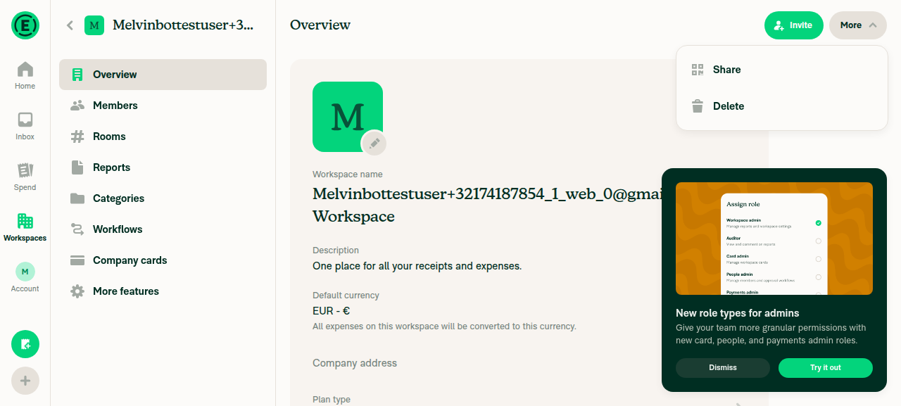
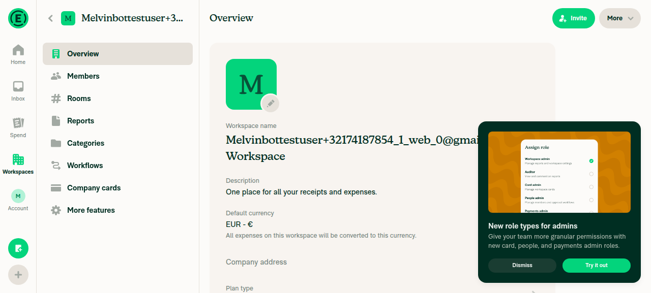
Workspace More (ThreeDotsMenu) open Workspace Overview interactive after select then Back

Next Steps: Reply with @MelvinBot <feedback> to refine. The two candidates above need a human keyboard-only pass (Windows + Chrome, plus iOS/macOS Safari) since focus placement can't be machine-verified here.

@melvin-bot

melvin-bot Bot commented Aug 18, 2026

Copy link
Copy Markdown

We did not find an internal engineer to review this PR, trying to assign a random engineer to #96971 as well as to this PR... Please reach out for help on Slack if no one gets assigned!

@melvin-bot
melvin-bot Bot requested a review from danieldoglas August 18, 2026 19:34
@danieldoglas
danieldoglas merged commit 82dc510 into Expensify:main Aug 19, 2026
36 of 38 checks passed
@OSBotify

Copy link
Copy Markdown
Contributor

✋ This PR was not deployed to staging yet because QA is ongoing. It will be automatically deployed to staging after the next production release.

@github-actions

Copy link
Copy Markdown
Contributor

🚧 danieldoglas has triggered a test Expensify/App build. You can view the workflow run here.

@OSBotify OSBotify mentioned this pull request Aug 20, 2026
61 tasks done
@OSBotify

Copy link
Copy Markdown
Contributor

🚀 Deployed to staging by https://github.com/danieldoglas in version: 9.4.57-0 🚀

platform result
🕸 web 🕸 success ✅
🤖 android 🤖 success ✅
🍎 iOS 🍎 success ✅

@MelvinBot

Copy link
Copy Markdown
Contributor

🤖 No help site changes required — no draft PR created.

I reviewed the changes in this PR against the help site articles under docs/articles.

What this PR changes: it fixes keyboard focus not returning to the ⋯ (3-dot) menu trigger after pressing Back, by adding a shouldReturnFocus prop to PopoverMenu and opting ThreeDotsMenu into it (plus a unit test). This is an internal focus-management / accessibility fix (WCAG 2.4.3 Focus Order) with no change to any user-facing feature, setting label, tab, button, or workflow.

Why no docs are needed: the HelpDot articles document product features and workflows (how to duplicate a workspace, manage categories, etc.), not internal keyboard-focus behavior. Nothing in docs/articles describes tab order or focus-return behavior, so there is no article whose steps or screenshots this change would make stale. I searched the docs for keyboard-navigation / focus / accessibility content and found no article covering this behavior.

If you disagree and think a specific article should mention this, let me know which one and I'll draft the update.

@Krishna2323, please review the linked help site PR and confirm it reflects the current behavior. Then mark the linked help site PR Ready for review


view run

@OSBotify

Copy link
Copy Markdown
Contributor

🚀 Deployed to production by https://github.com/Beamanator in version: 9.4.57-3 🚀

platform result
🕸 web 🕸 success ✅
🤖 android 🤖 success ✅
🍎 iOS 🍎 success ✅

Bundle Size Analysis (Sentry):

Sign up for free to join this conversation on GitHub. Already have an account? Sign in to comment

Labels

None yet

Projects

None yet

Development

Successfully merging this pull request may close these issues.

6 participants