Conversation


…bles and content cards

Co-authored-by: Shawn Borton <shawnborton@users.noreply.github.com>

 melvin-bot
Bot
added
Melvin-Test-Android
Melvin-Test-Web
melvin-bot
Bot
added
Melvin-Test-Android
Melvin-Test-Web

|
🚧 shawnborton has triggered a test Expensify/App build. You can view the workflow run here. |
This comment has been minimized.
This comment has been minimized.

|
The Root cause: two PRs that each passed on their own collided on
The migration PR merged second, so its sweep never saw those two new call sites. They are still missing the required property on It is already tracked: Investigate workflow job failing on main: typecheck / typecheck, opened 34 minutes before this PR's Next step: nothing to change on this branch. Once Why this isn't this PR's fault
The other two non-green checks are also unrelated to the code: |

|
@MelvinBot please also implement this change for expense report/invoice/trip previews found in the Inbox in expenses chats. |
|
Still nothing to fix on this branch — both real failures come from
1. Unchanged from my previous comment. [Phase 2] Part 4 - Migrate deprecatedGetReportName to getReportName in libs made 2. The single error is Thread beta overrides into the remaining util call sites added a required [No QA] Add a non-production link back to token-based (SOAP) NetSuite setup then deleted that mock, 11 minutes after this PR's lint job started. Current Next step: wait for the Timeline, and why none of this comes from this PRThis PR changes only style values and the two components that consume them. It touches neither
CI lints and typechecks the PR-merged-with-
|
|
🤖 Android test steps verification results: ✅ pass All 7 affected surfaces (home widgets, workspace/account
The PR's |
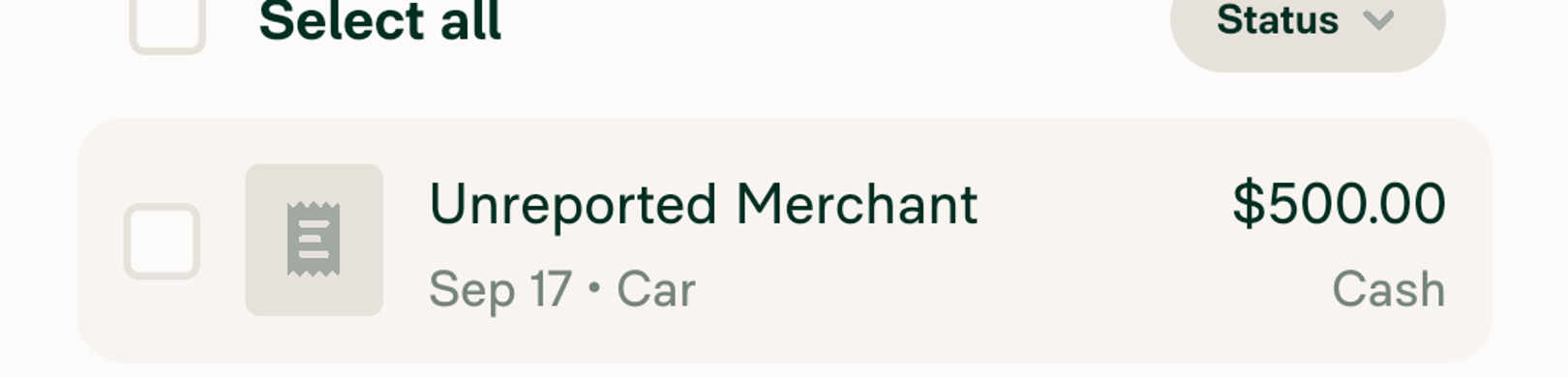
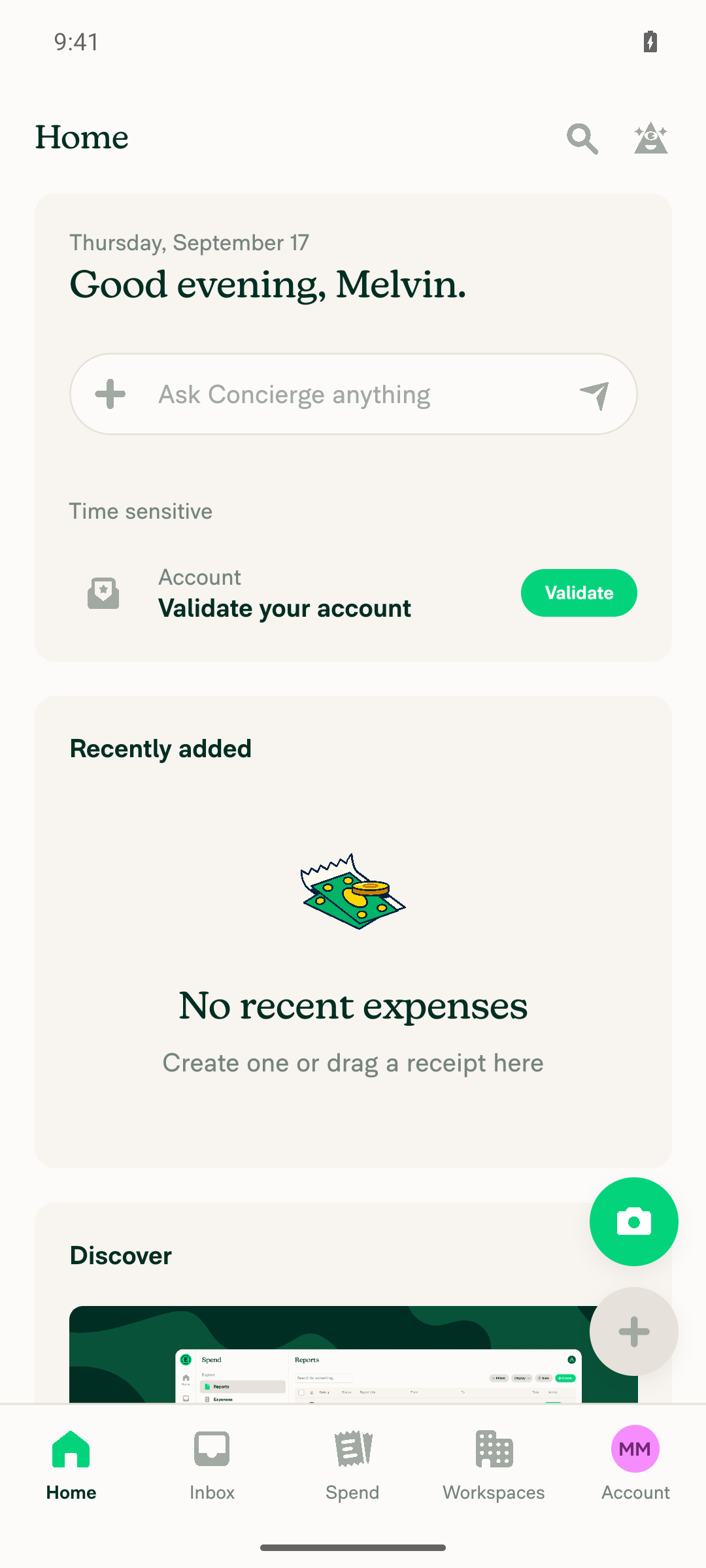
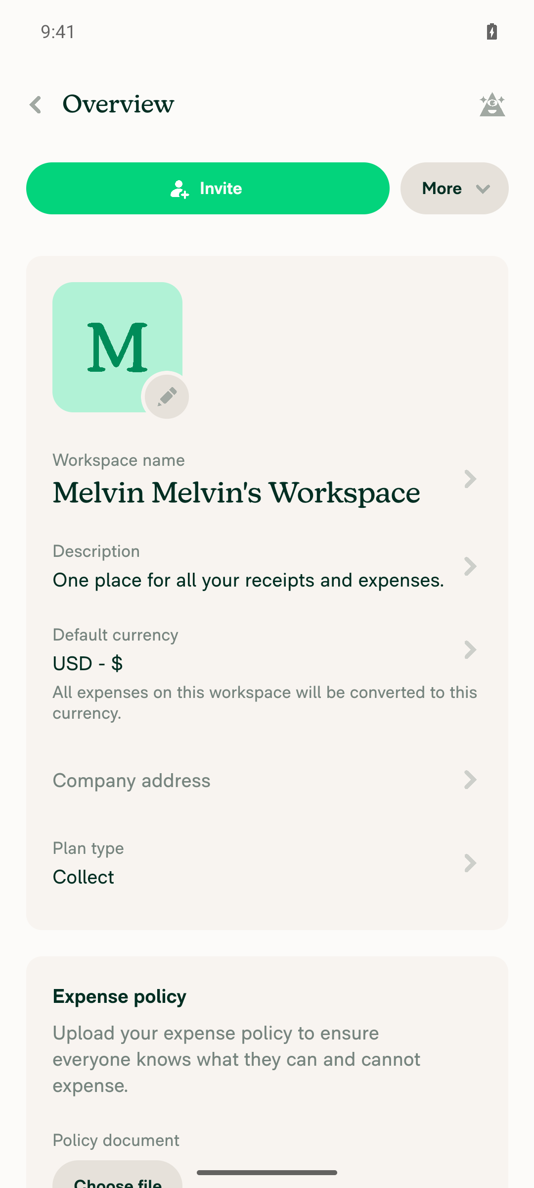
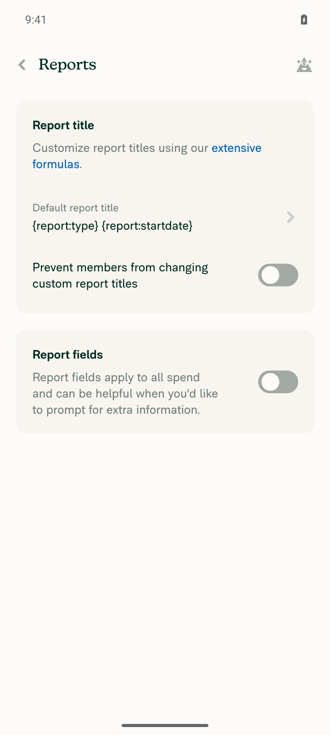



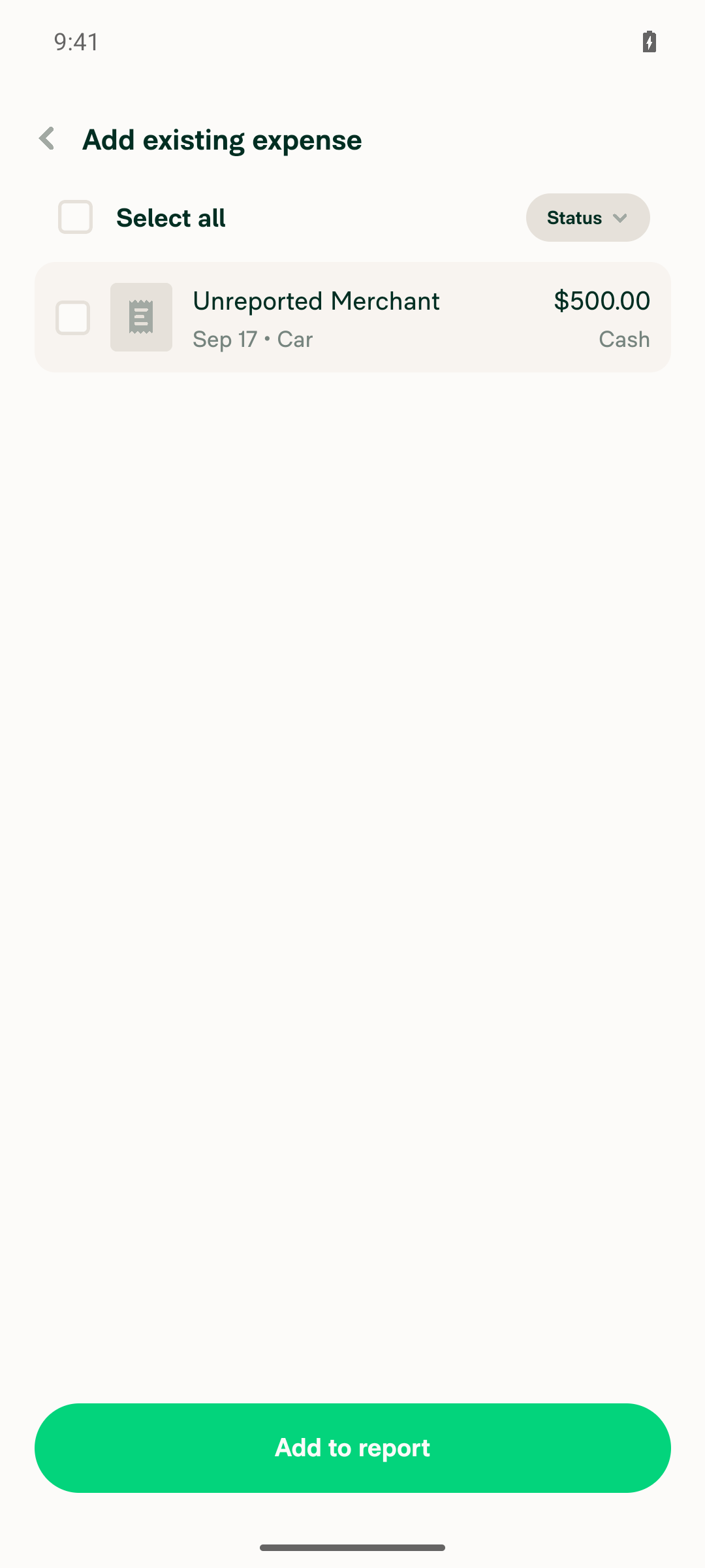
…reviews

Co-authored-by: Shawn Borton <shawnborton@users.noreply.github.com>
|
Done — pushed as Each preview card stacks two views that both carry the corner, so they move together:
Expense reports and invoices share one component — Three judgement calls worth a lookThe receipt thumbnail had to go down, not up. It sits The carousel cards had to move with their container. One rename. Deliberately left alone: One gap you should know about. I could not visually verify these cards. |
|
All checks now pass. Nothing to fix, so I pushed no change.
Current state: 34 passing, 0 pending, 1 failing. The one red check is |
|
@MelvinBot please also implement this for all of the chart container cards in Spend > Insights |
Co-authored-by: Shawn Borton <shawnborton@users.noreply.github.com>
|
Done — pushed as
All five Insights charts route through one wrapper, so a single value covers the whole section. Two things worth a look before you approveThis also moves the charts Concierge posts in chat. I took the chart's own loading surface down too. Left alone: One gap, same as last round. I could not visually verify these cards. Also: I could not edit the PR description in this environment, so its |
|
🚧 shawnborton has triggered a test Expensify/App build. You can view the workflow run here. |
|
🤖 There's nothing to fix in code — no check is failing on this PR's changes. The only red check is Check independent approval, from Every other check passed — Two things do still need a human, though:
Next Steps: Reply with |
This comment has been minimized.
This comment has been minimized.
|
@MelvinBot for the cards in More features, can we make those use 12px border radius as well? 
|
Co-authored-by: Shawn Borton <shawnborton@users.noreply.github.com>
|
Done — pushed as Worth knowing: those cards were at 8px, not 16 — they used One question for you. Still not verified visually. This is now the third run in a row where the CI web session was unusable, and it's the same failure each time: the prestart onboarding macro diverges on the As before, I couldn't edit the PR description in this environment, so it doesn't mention this commit. |
|
🚧 shawnborton has triggered a test Expensify/App build. You can view the workflow run here. |
This comment has been minimized.
This comment has been minimized.
|
@Expensify/design can you take this for a spin please? I think I like this, but I just want to make sure we like it enough to keep making progress (we'll have to find all of the cascading effect of nested border radii, etc). |

|
Works fine to me. I personally think i prefer the desktop radius to be 16px on the home cards, but fine if y'all wanna make it 12 everywhere. I do think the spacing here becomes a bit extra odd though: 
Here it looks great: 
|
|
@MelvinBot pull main and fix any conflicts please |
In what sense? Not disagreeing, just not sure I'm seeing what Jon is seeing 😆 |
…TablesAndCards

Co-authored-by: Shawn Borton <shawnborton@users.noreply.github.com>
…TablesAndCards

Co-authored-by: Shawn Borton <shawnborton@users.noreply.github.com>
|
MelvinBot has made 6 consecutive commits trying to fix CI failures. Automatic CI fix dispatches are now paused for this PR. Next steps: A human should review the recent commits and resolve the conflicting CI errors manually. |
|
Merged
AI tests re-run on the merged branch
One thing still open from before, unchanged by this merge: browser confirmation of the new radius on the chat preview cards was never captured, so that visual check is still outstanding. |
|
🚧 shawnborton has triggered a test Expensify/App build. You can view the workflow run here. |
This comment has been minimized.
This comment has been minimized.

|
Noticed that on these grouped tables it looks like the top border-radius is still 8px (but the bottom is 12): 
To be honest this really doesn't feel all that different to me, so I'm not against moving forward with it to simplify/consolidate. I do want to know what Jon meant about the spacing thing though haha, because I'm not sure I'm seeing it right either! |

|
Good catch on that! @MelvinBot can you make sure the top header row in any tables on Spend (for grouped results, etc) use 12px border radius? Check things like border-top-left radius and border-top-right radius. |
|
@dannymcclain @dubielzyk-expensify I would say if no one is really feelin' strongly about this, then we should just close. I think the idea is good on paper but maybe we can table it until we really feel like we need 12px to come into our lives... I do think it feels really nice on the More features page, and I bet it would be nice for places like New Rule for the card-based options. |
Co-authored-by: Shawn Borton <shawnborton@users.noreply.github.com>
|
Fixed and pushed as
That single style is the header for every Spend/Search view — expenses (flat), expenses (grouped), Reports, Tasks and Chats all render it through Checks run
Not verified in a browser: the web session for this run died during sign-in (blank page, zero DOM nodes) and couldn't be recovered, so I never got to read the computed radius off the live table. The change is a variable swap on the one style that draws those corners, but the visual confirmation is still outstanding — same gap I flagged on the merge commit. One thing worth saying out loud: I saw your follow-up about closing this if nobody feels strongly. This commit is small and self-contained, so it's easy to keep or drop — it doesn't change the close-or-continue call. view run · no recording available |
|
@MelvinBot for the Rules revamp beta, when you go to make a new rule, can you use 12px border radius for these options? Find similar options across the app that need to be updated too please |

Ah I forgot to check this spot earlier and now that I have, I agree, the extra radius there does feel really nice.
The only reason I don't feel super strongly about it is because it's such a subtle change—I don't think it impacts the UI all that much in a super tangible way. So to me it's hard to have a strong opinion because the change isn't that strong of a thing? Does that make sense at all? The idea of trying to standardize the border-radius of "card like UI elements" makes perfect sense to me, but at the same time (to argue against myself hahah), our current border radii don't feel overtly broken to me as is. 😵💫 🤷 |
Co-authored-by: Shawn Borton <shawnborton@users.noreply.github.com>
|
Done — pushed as The New rule page's cards come from Screens this changes:
The Expensify Card type step and the bank-account purpose page are the closest twins of your screenshot — illustration + title + description + chevron, in a stack. The agent-rule suggestion cards composed their radius inline from Three option-card sets I deliberately left alone — your call
Also worth knowing: Checks run
Not verified in a browser: the web session died during sign-in again this run (blank page, zero DOM nodes, same broken onboarding replay as before), so I couldn't read the computed radius off the live New rule page. Every screen above is driven by the four styles in the diff, but the visual check is still outstanding. view run · no recording available |
|
🚧 shawnborton has triggered a test Expensify/App build. You can view the workflow run here. |
|
🧪🧪 Use the links below to test this adhoc build on Android, iOS, and Web. Happy testing! 🧪🧪
|


4 participants


Explanation of Change
Tables and content cards are both "a surface with a different background that wraps content", but they used two different corner radii: tables were
8pxand content cards were16px. This harmonizes them on a single12pxvalue.Adds one new variable,
componentBorderRadiusCardAndTable: 12, insrc/styles/variables.tsand applies it to the shared styles that every affected surface already routes through, so this is a value change rather than a sweep of individual screens:styles.tableTopRadius/styles.tableBottomRadius(8→12) — the outer corners of every table:components/Table(Workspace editor, Domain editor and Account tables), the Spend/Search tables, the report transaction table, and the RHP tables such as Merge Expense and Add expense to report. The table loading skeletons use the same styles, so they stay in sync.StyleUtils.getSearchTableHighlightBorderRadius(8→12) — the row highlight animation on narrow layouts, so it matches the table it sits in.styles.cardSectionContainer(16→12) — theSectioncomponent, which renders the content cards in the Workspace editor (Overview, Reports, Time, etc.), the Domain editor (SAML) and Account. This also covers the trip/reservation detail cards, which areSections.styles.widgetContainer(16→12) — the widget cards on the Home page.styles.transactionListItemStyle(hardcoded8→ the new variable) — transaction rows. Inside Search tables this radius is already overridden per row, so the visible effect is on the standalone lists such as Add expense to report.Chat / Inbox preview cards
Per review feedback, the same
12pxis applied to the report-action preview cards that appear in a chat. Each of these cards stacks two views that both carry the corner, so they are changed together:styles.reportContainerBorderRadius(16→12) — the innercardBG/hover wrapper of the expense report and invoice preview, its empty and no-access placeholder states, and the scanning/whisper wrapper on the single expense preview.styles.borderedContentCardLarge→ renamedstyles.borderedReportPreviewCard(16→12) — the bordered variant of the expense report / invoice preview card. It had exactly one consumer (MoneyRequestReportPreviewBody), and leaving a key namedLargeon the12value whilecomponentBorderRadiusLargestays16would be misleading, hence the rename.styles.moneyRequestPreviewBox(16→12) — the single expense preview card in a chat, the transaction cards inside the report preview's carousel, and the inner surface of the trip room preview. The carousel cards had to move with their container, otherwise the inner corners would end up rounder than the card holding them.styles.reportPreviewBox(16→12) — the outer corner of the trip / travel room preview.styles.reportActionItemImages(hardcoded12→componentBorderRadiusCardAndTable - reportActionItemImagesInset, so8) — the receipt thumbnail row at the top of a preview card. It is inset4pxfrom the card edge byreportActionItemImagesContainer, so its radius has to be the card radius minus that inset to stay concentric; the old12was16 - 4. The4is now a sharedreportActionItemImagesInsetconstant used by both styles so the two can't drift apart again.Expense reports and invoices share one component —
ActionContentRouterroutes everyREPORT_PREVIEWaction toMoneyRequestReportPreview— so one radius covers both.Left untouched:
componentBorderRadius: 8andcomponentBorderRadiusLarge: 16themselves,styles.borderRadiusComponentLarge(a generic 16px utility used by eight-plus unrelated screens, which only shows up here as the trip card's inner reservations box), andstyles.reportActionItemImagesMore(the "+N more receipts" badge corner, which is decorative rather than concentric with the card).Fixed Issues
$ #101462
PROPOSAL: #101462 (comment)
Tests
// TODO: The human co-author must fill out the tests you ran before marking this PR as "ready for review"
// Please describe what tests you performed that validates your changed worked.
Offline tests
Not applicable — this is a style-value change with no network behavior.
QA Steps
// TODO: The human co-author must fill out the QA tests you ran before marking this PR as "ready for review".
// Please describe what QA needs to do to validate your changes and what areas do they need to test for regressions.
PR Author Checklist
### Fixed Issuessection aboveTestssectionOffline stepssectionQA stepssectionStyleUtils.getBackgroundAndBorderStyle(theme.componentBG))npm run compress-svg)Avataris modified, I verified thatAvataris working as expected in all cases)Designlabel and/or tagged@Expensify/designso the design team can review the changes.mainbranch was merged into this PR after a review, I tested again and verified the outcome was still expected according to theTeststeps.AI Tests
Run locally by MelvinBot on this branch:
npm run typecheck— passed.npm run lint-changed— passed.npm run react-compiler-compliance-checkon the touched components — passed.npm test -- tests/unit/useSearchTableItemHighlightTest.ts tests/unit/useListItemHighlightTest.ts— 12 tests passed (these are the tests that assert on the highlight border radius).npm test -- tests/ui/MoneyRequestReportPreview.test.tsx tests/ui/TransactionPreviewContentTest.tsx tests/ui/FlightTripDetailsTest.tsx tests/ui/ReportActionItemTest.tsx— 253 tests passed (the suites covering the chat preview cards).scripts/findUnusedStyles.ts— could not be executed in this environment. The one renamed style key (borderedContentCardLarge→borderedReportPreviewCard) was checked by hand: it had a single consumer, which was updated, and no references to the old name remain.Screenshots/Videos
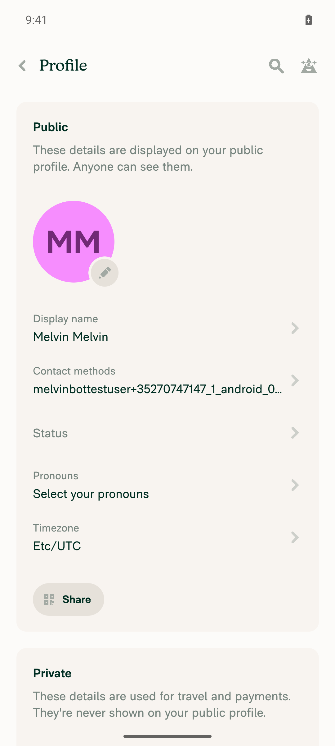
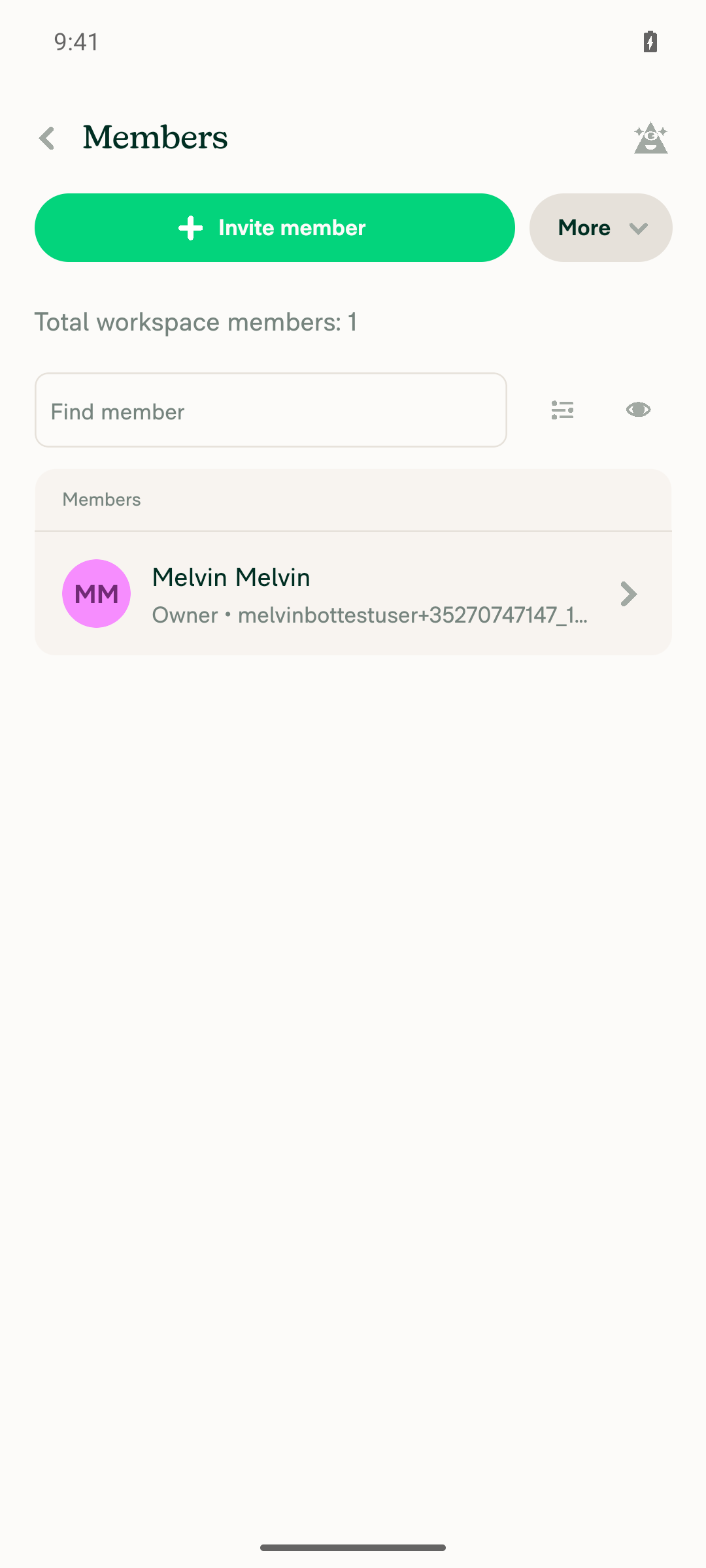
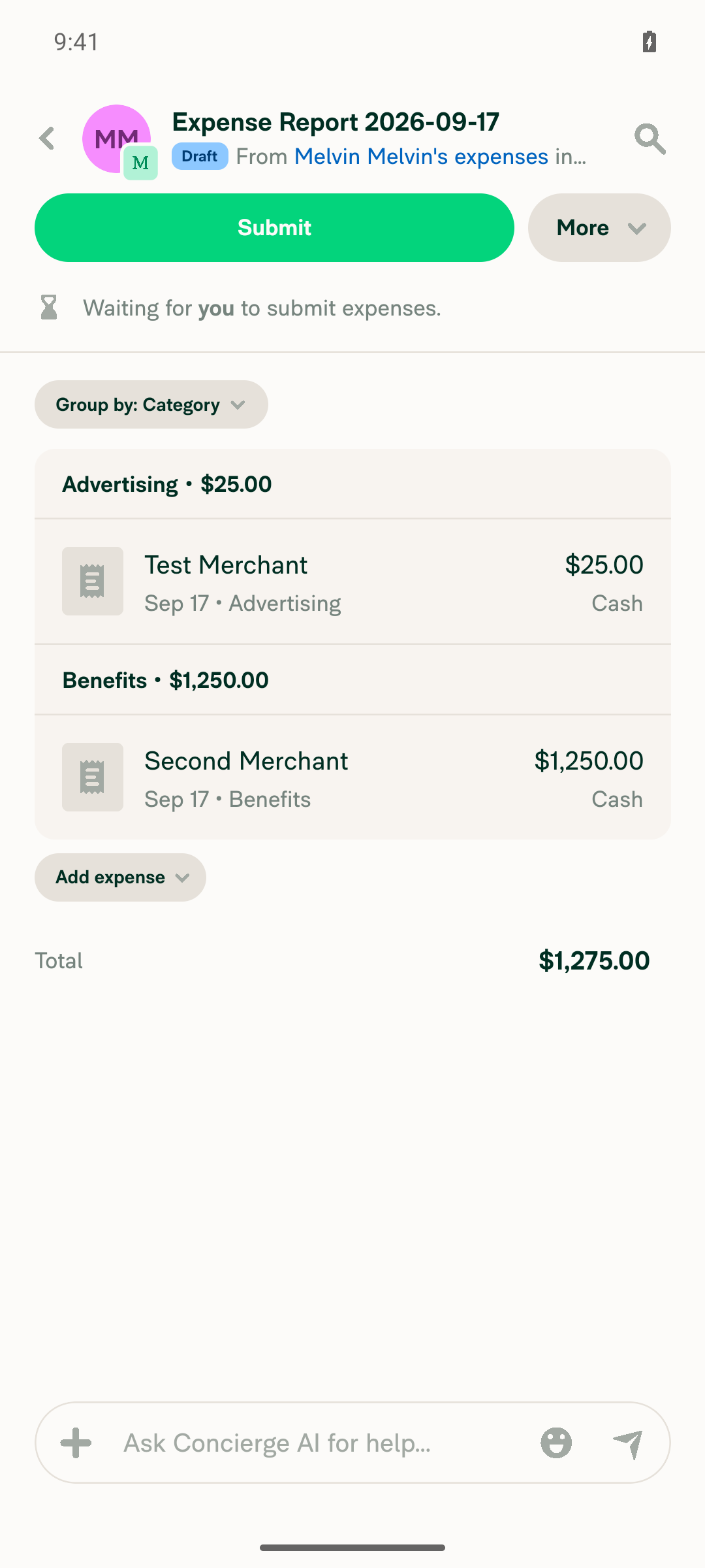
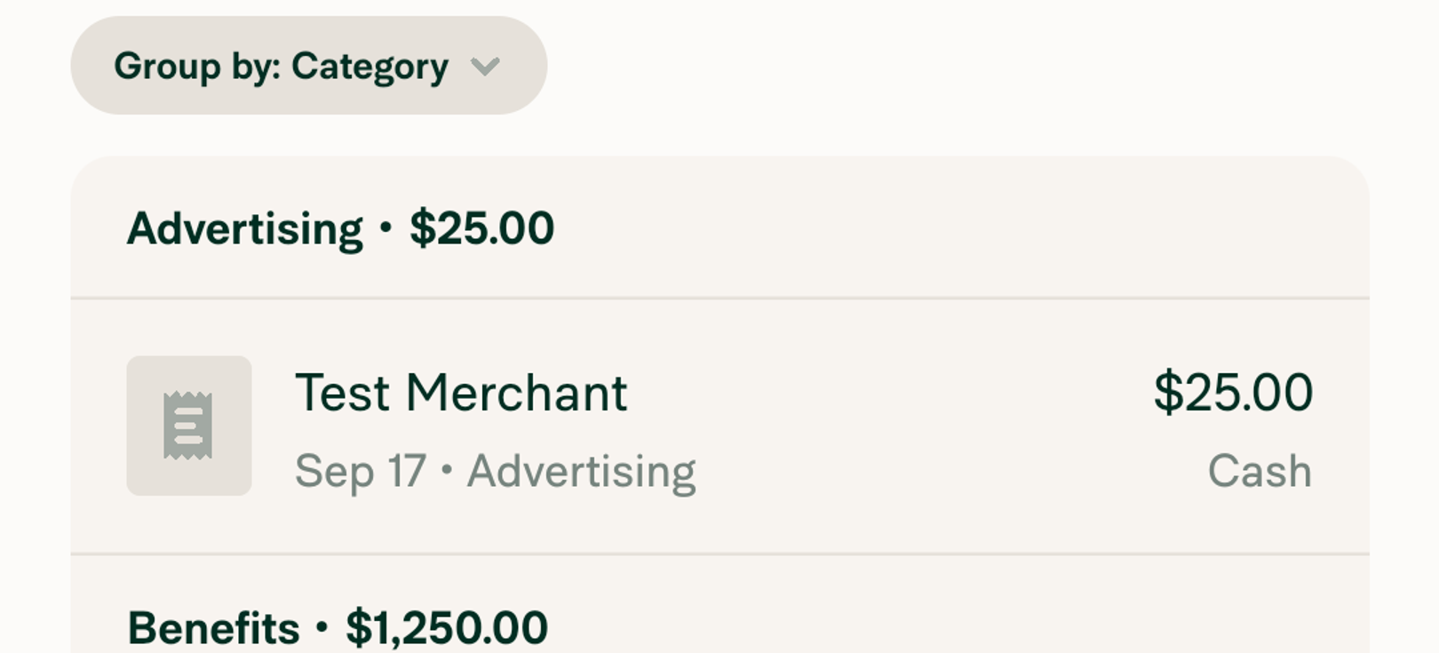
Android: Native
Android: mWeb Chrome
iOS: Native
iOS: mWeb Safari
MacOS: Chrome / Safari